Editorial Design & Typography — 2020
Les Fourberies de Scapin
De Scapin — in text-message language
Typographic concept
and layout.
The Project
Molière,
abbreviated.
Les Fourberies de Scapin set entirely in text-message language: the 1671 text run through the filter of contemporary abbreviated writing.
The constraint is purely typographic. Vowels disappear, words contract, and letter-spacing is pushed until reading becomes an effort — precisely the effort the original text asks of a reader today.
My Role
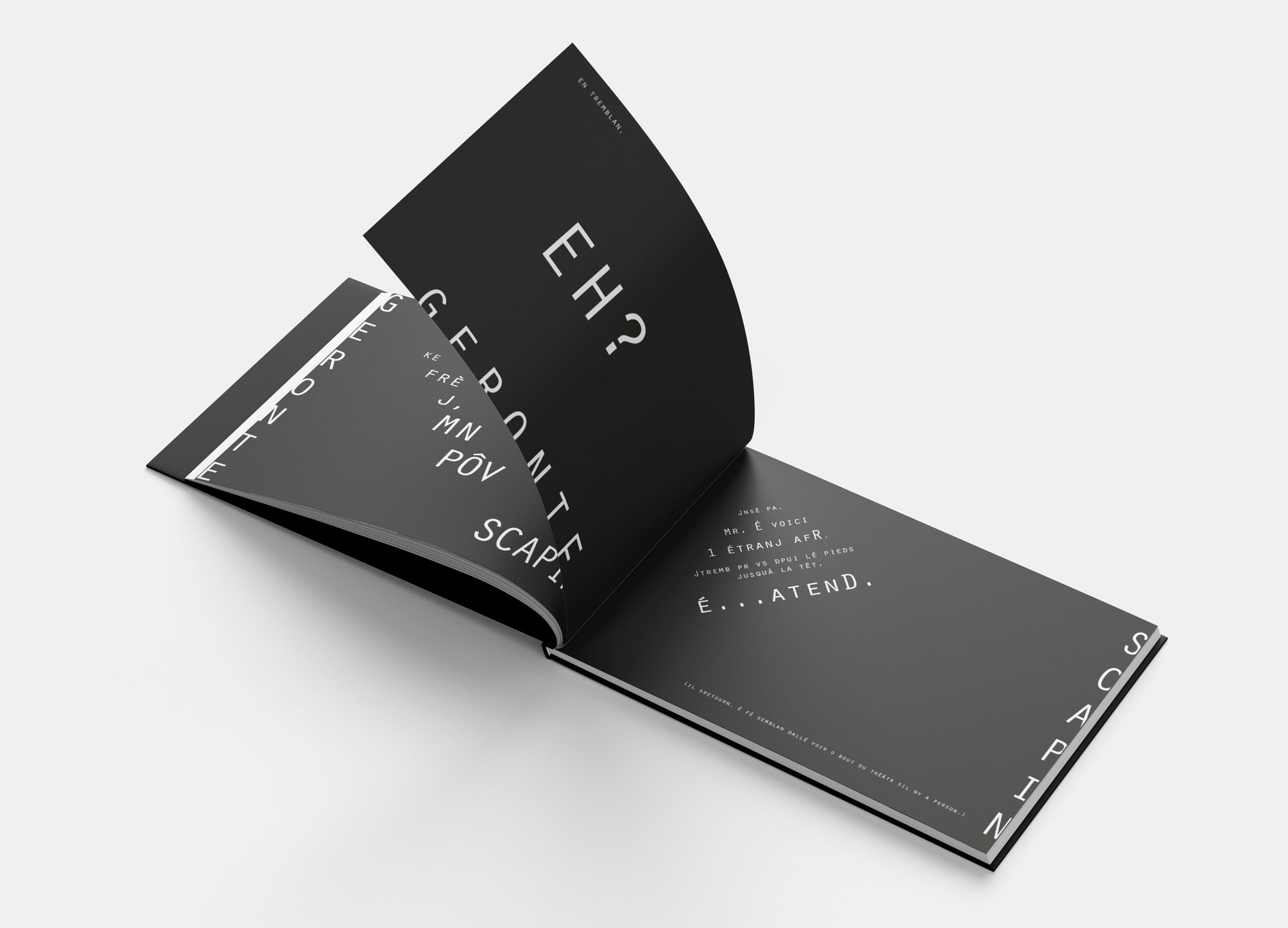
The object is a landscape hardback, printed white on black. The horizontal format exaggerates the stretch of the lines and brings the spread closer to a screen.
01
Text Rewriting
02
Typographic System
03
Letter-spacing
04
Spread Layout
05
Production
Building the Identity
White on black, and a great deal of air.
Maximum contrast and wide letter-spacing are the layout’s only two tools.
Palette sampled from the project’s own visuals.
The Decision
Making a classic unreadable to force a rereading.
The Work
In detail.
The cover
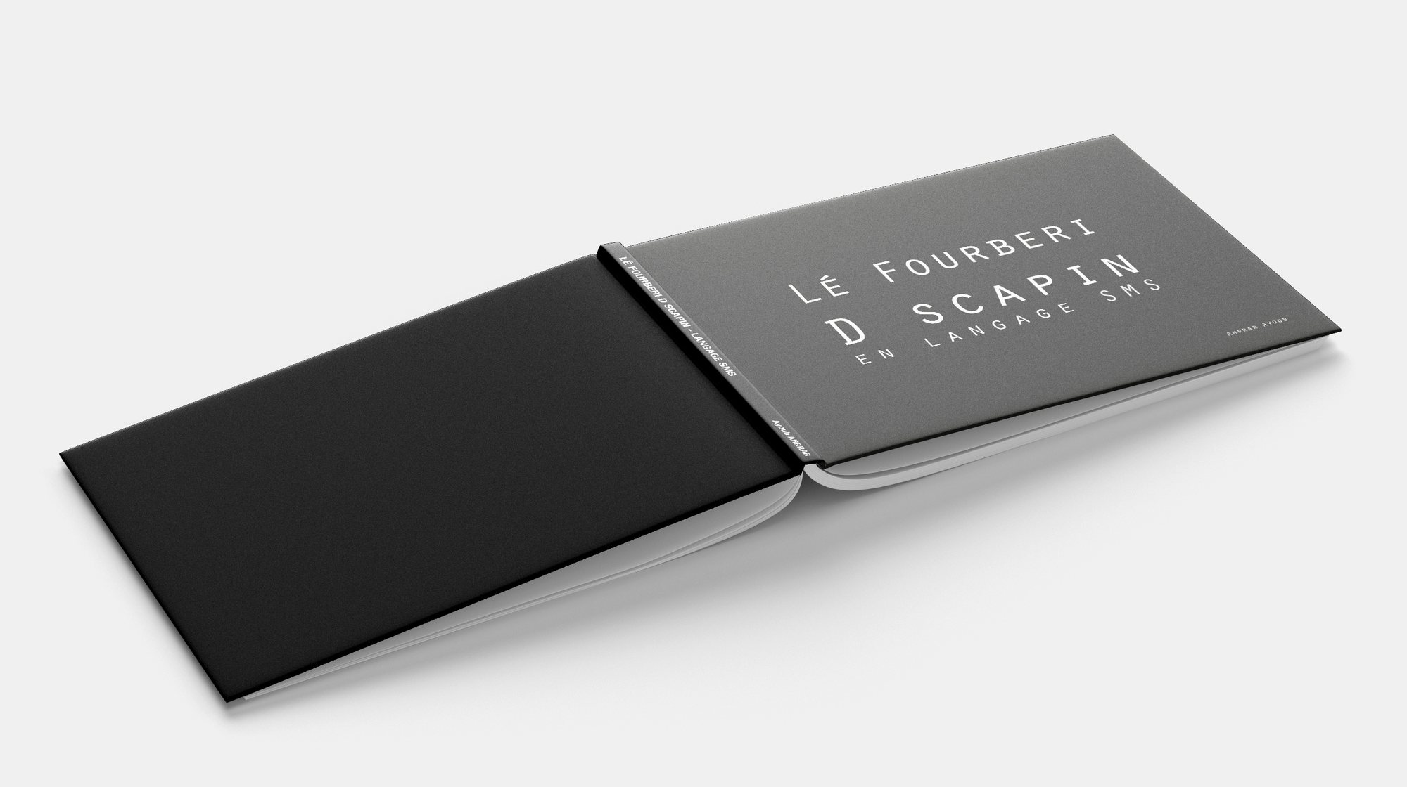
The title already abbreviated — “LE FOURBERI D SCAPIN, EN LANGAGE SMS” — set in widely spaced caps on the black cover. The constraint is announced before the book is even opened.
The interior
Lines of dialogue are spread across the spread in widely separated blocks. “EH?” occupies the top of the right-hand page on its own: the dialogue becomes a score.
In short
A text from 1671,
returned to its difficulty.
The exercise wasn’t to modernise Molière but to reproduce, using today’s codes, the distance between a reader and the original text.
Les Fourberies de Scapin