The Project
A cover
with no breathing room.
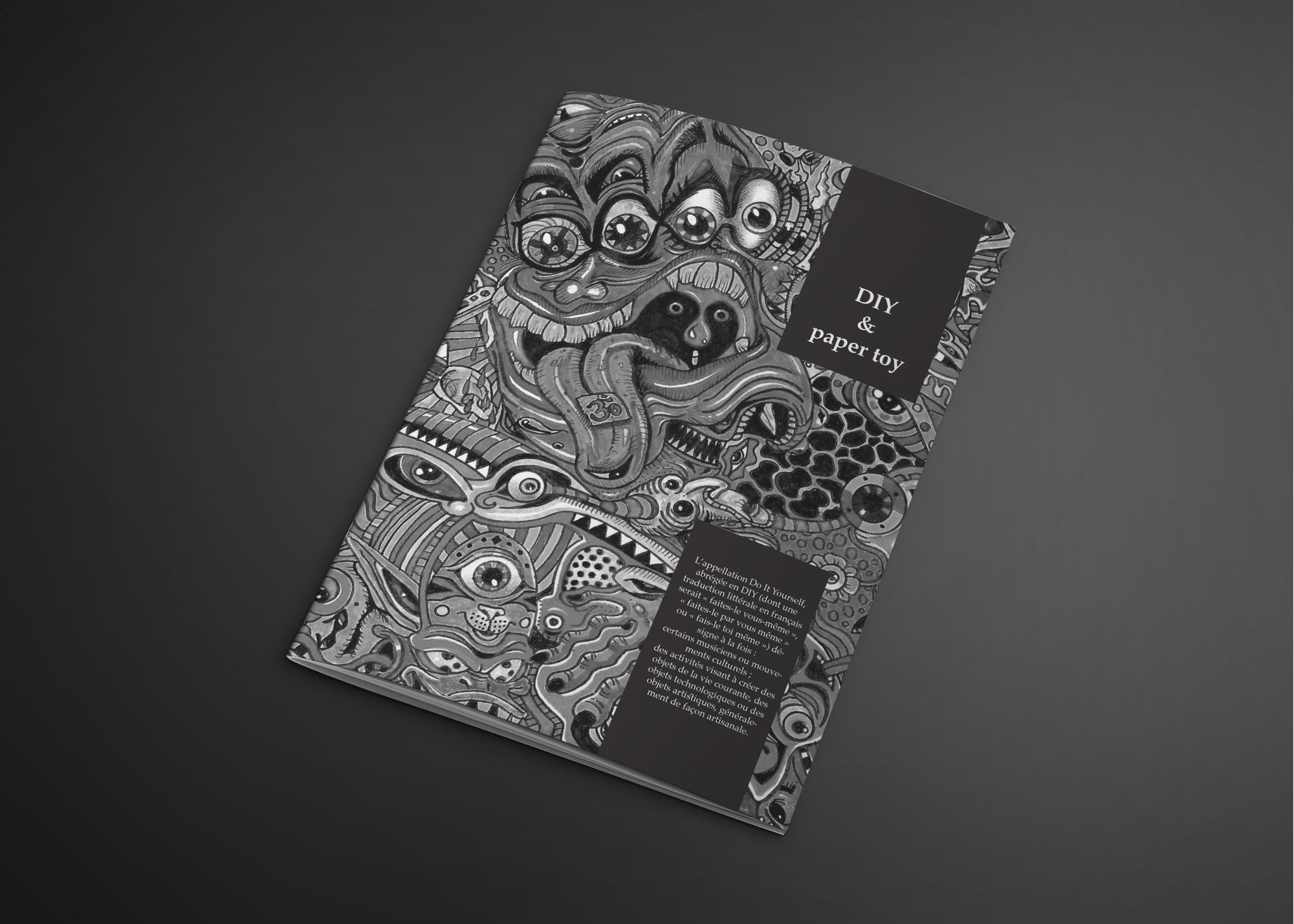
A book on DIY and paper toys, its cover entirely covered by a line drawing — eyes, mouths, organic motifs — with no area left blank.
The typography doesn’t fight the illustration: it settles into solid black cartouches placed in the composition like windows. The title is set in a light serif, deliberately at odds with the drawing’s exuberance.
My Role
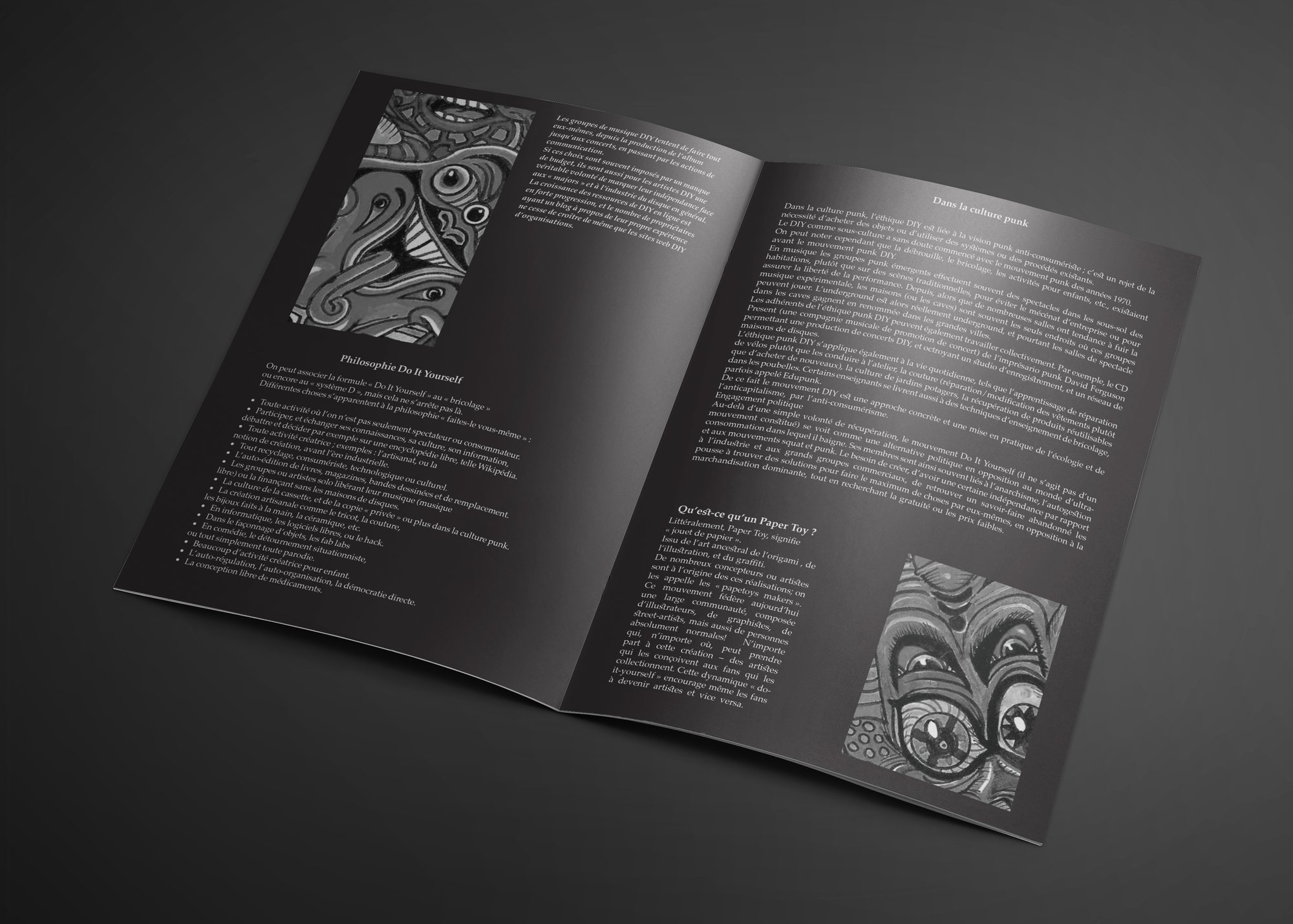
Inside, the balance flips: the ground turns dark and quiet, the text sits in two regular columns, and the illustration returns only as framed fragments. The density of the cover is what makes the interior readable.
01
Cover Illustration
02
Typographic Cartouches
03
Interior Grid
04
Contrast Control
05
Gatefold
Building the Identity
One ink, pushed to its limit.
The whole hierarchy rests on the contrast between the illustration’s fine line and the solid blacks of the typography.
Palette sampled from the project’s own visuals.
The Decision
Saturate the cover so the pages can breathe.
The Work
In detail.
The cover
The drawing covers the whole surface. Two black cartouches — the title upper right, a text block below — cut out the only areas of rest.
The spread
A two-column interior on a dark ground, with two framed illustration vignettes facing each other. Contrast drops deliberately from the cover.
The gatefold
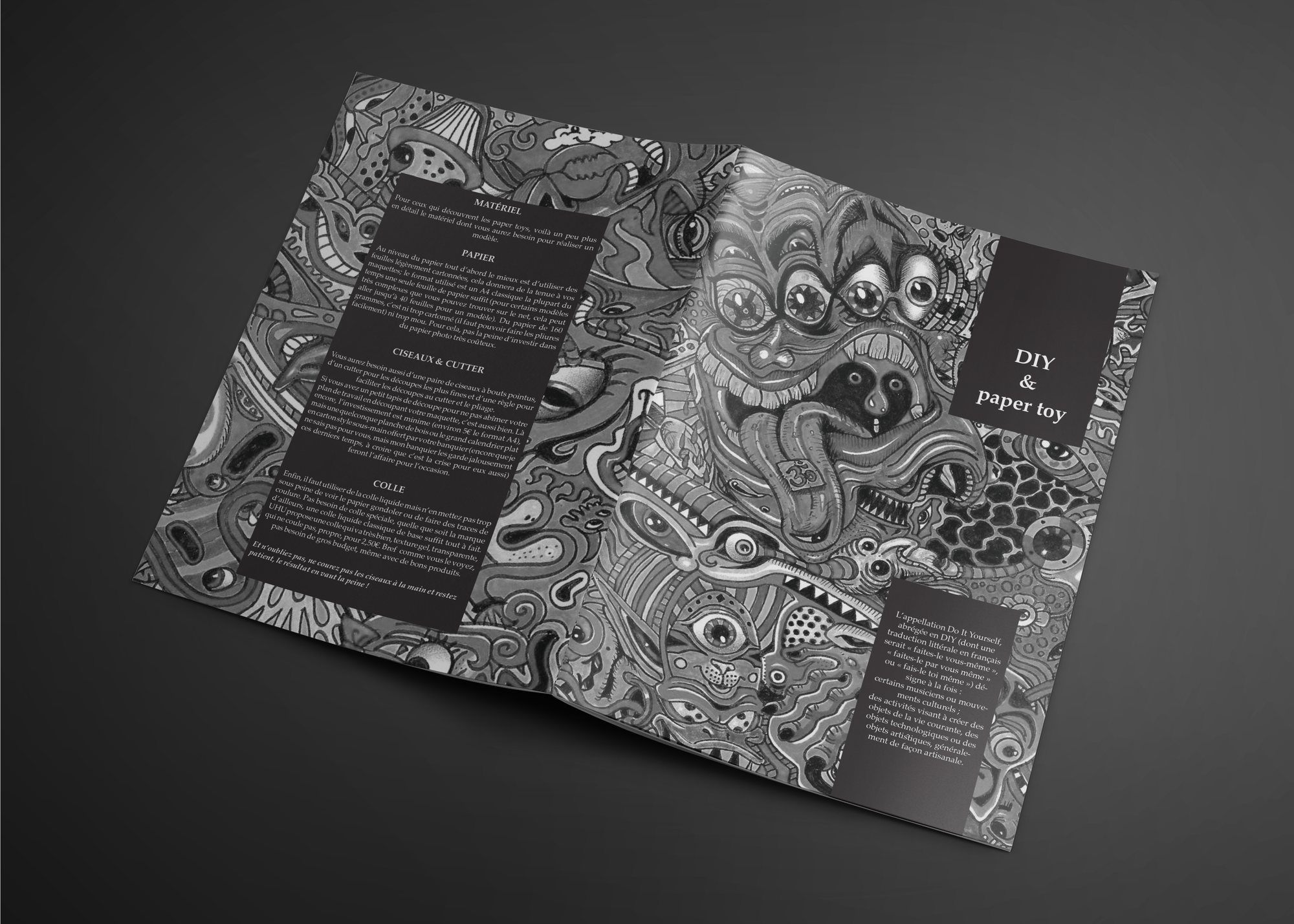
Opened flat, the book reveals the drawing at full width alongside a contents column in black cartouches on the left.
In short
An object that asks
to be handled.
The subject — making things yourself — called for an object that isn’t only read. The fully drawn cover is the first answer to that.
DIY & Paper Toy