Editorial Design — 2020
Book Covers — Folio
Paperback collection
Concept, painting and layout.
The Project
A title at the top,
a mark in the middle.
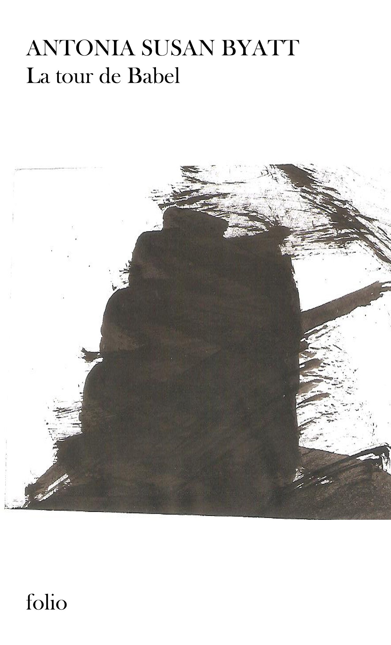
Four novels, one grid: Tolkien, Antonia Susan Byatt, Jules Verne and Herbert George Wells handled as a paperback collection.
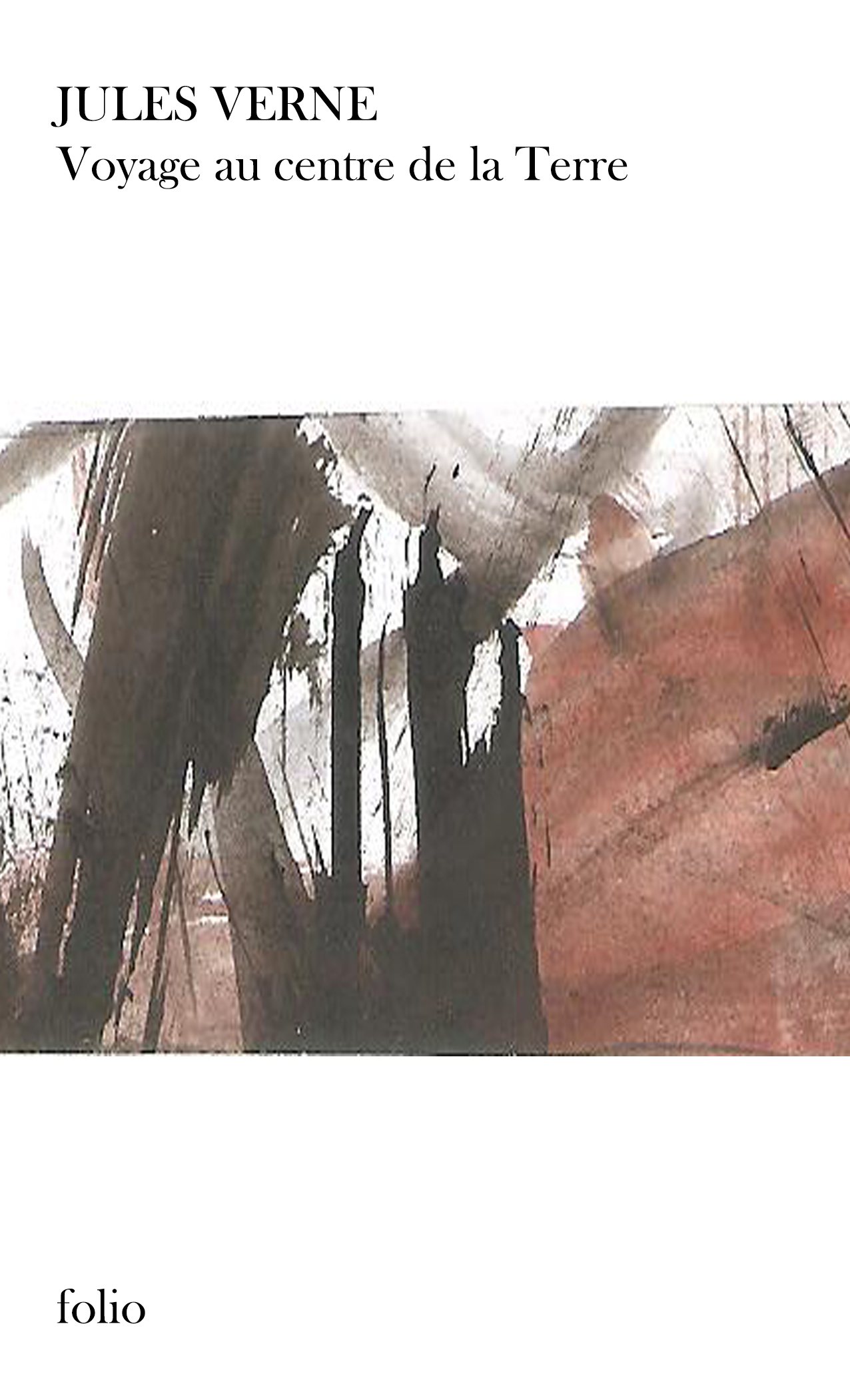
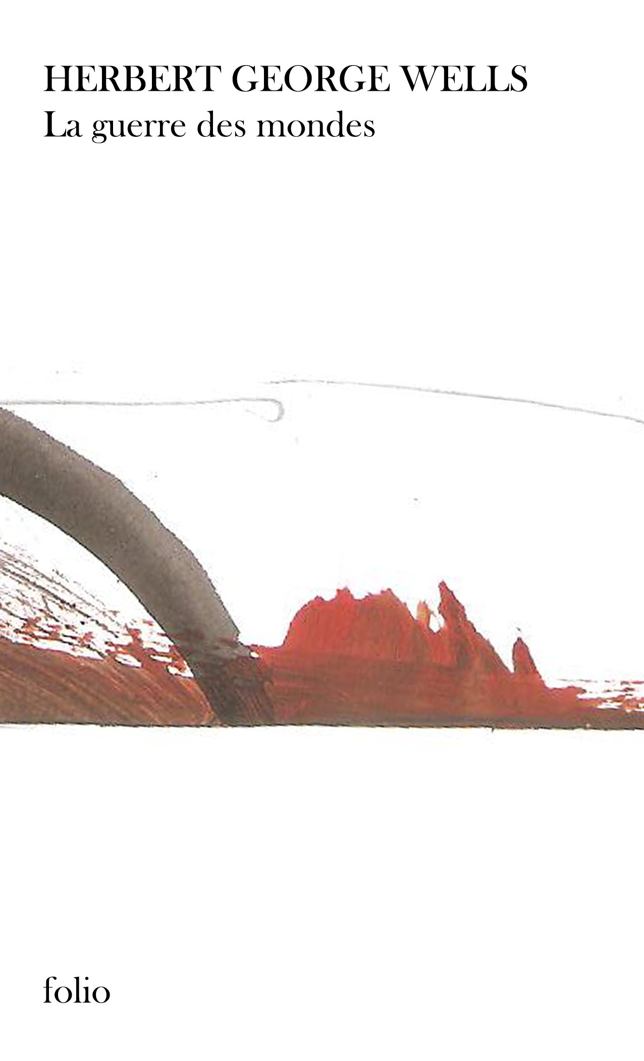
The rule is simple and never broken: the author’s name in serif caps, the title immediately below in lower case, a band of image at the centre, and the collection mark at the foot. Nothing else appears on the front.
My Role
The image is not an illustration of the story but an abstract painting — ink, wash, scraping. It offers an atmosphere rather than a scene, which lets four very different worlds live inside the same collection.
01
Collection Grid
02
Typographic Hierarchy
03
Painted Artwork
04
Image Treatment
05
Mockups
Building the Identity
White, and whatever the brush leaves.
The ground stays white across all four titles; colour enters only through the painted material.
Palette sampled from the project’s own visuals.
The Decision
A collection holds together through what doesn’t change between titles.
The Work
In detail.
In hand
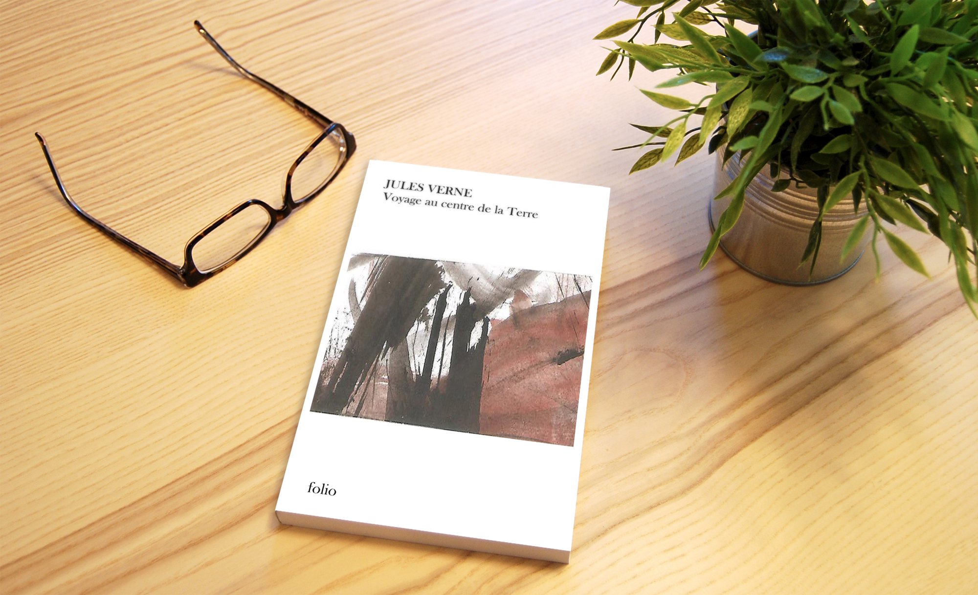
The Jules Verne volume on a desk. At this size the painted band reads as a texture rather than an image — which was the aim.
The collection
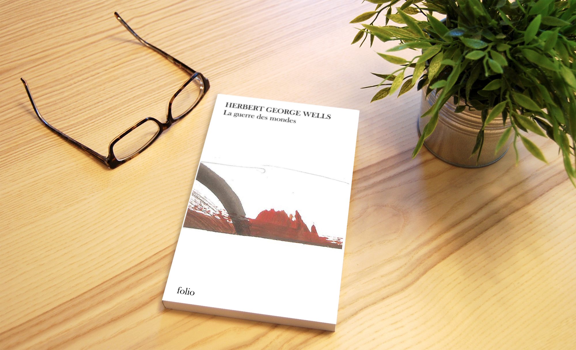
The Wells volume in the same shot: comparing the two photographs shows that only the content of the band changes.
Plates
The four titles

In short
Four authors,
one grid.
The difficulty in a collection isn’t designing one cover — it’s designing the rule that will produce forty.
Book Covers — Folio