The Project
Saying something
with a rose.
An out-of-home campaign for a florist, built on a single mechanic: the rose as a way of saying what you don’t dare put into words.
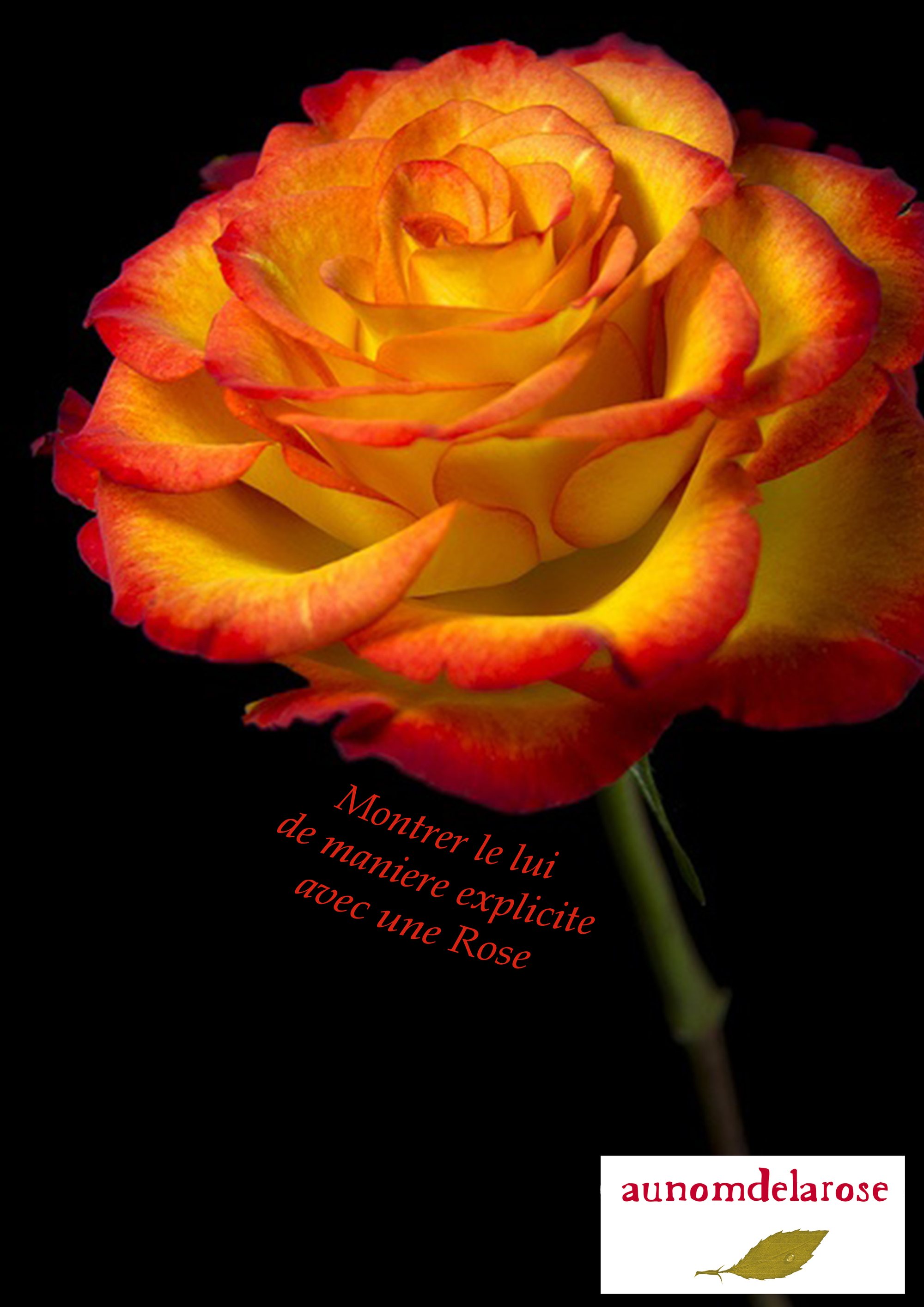
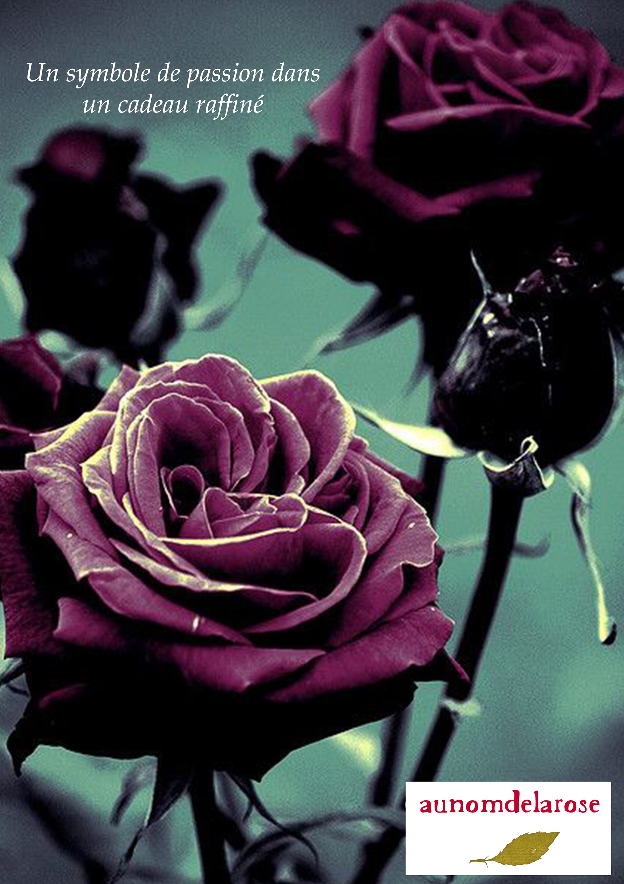
Each visual pairs a rose macro, pushed hard in colour, with a handwritten italic line laid diagonally across the image. The colours are deliberately untrue — sea green, magenta, saturated orange — to pull the campaign away from expected floral imagery.
My Role
The logotype always sits reversed in a white cartouche at the foot of the poster: whatever the ground, the brand signature stays in the same place at the same size. That is what holds the series together.
01
Concept & Copy
02
Photographic Direction
03
Colour Grading
04
Poster Composition
05
In-situ Mockups
Building the Identity
Flower colours that don’t exist.
The palette is the result of a deliberate grade: it’s there to turn a passer-by’s head, not to describe the flower.
Palette sampled from the project’s own visuals.
The Decision
A flower isn’t photographed — it’s staged.
The Work
In detail.
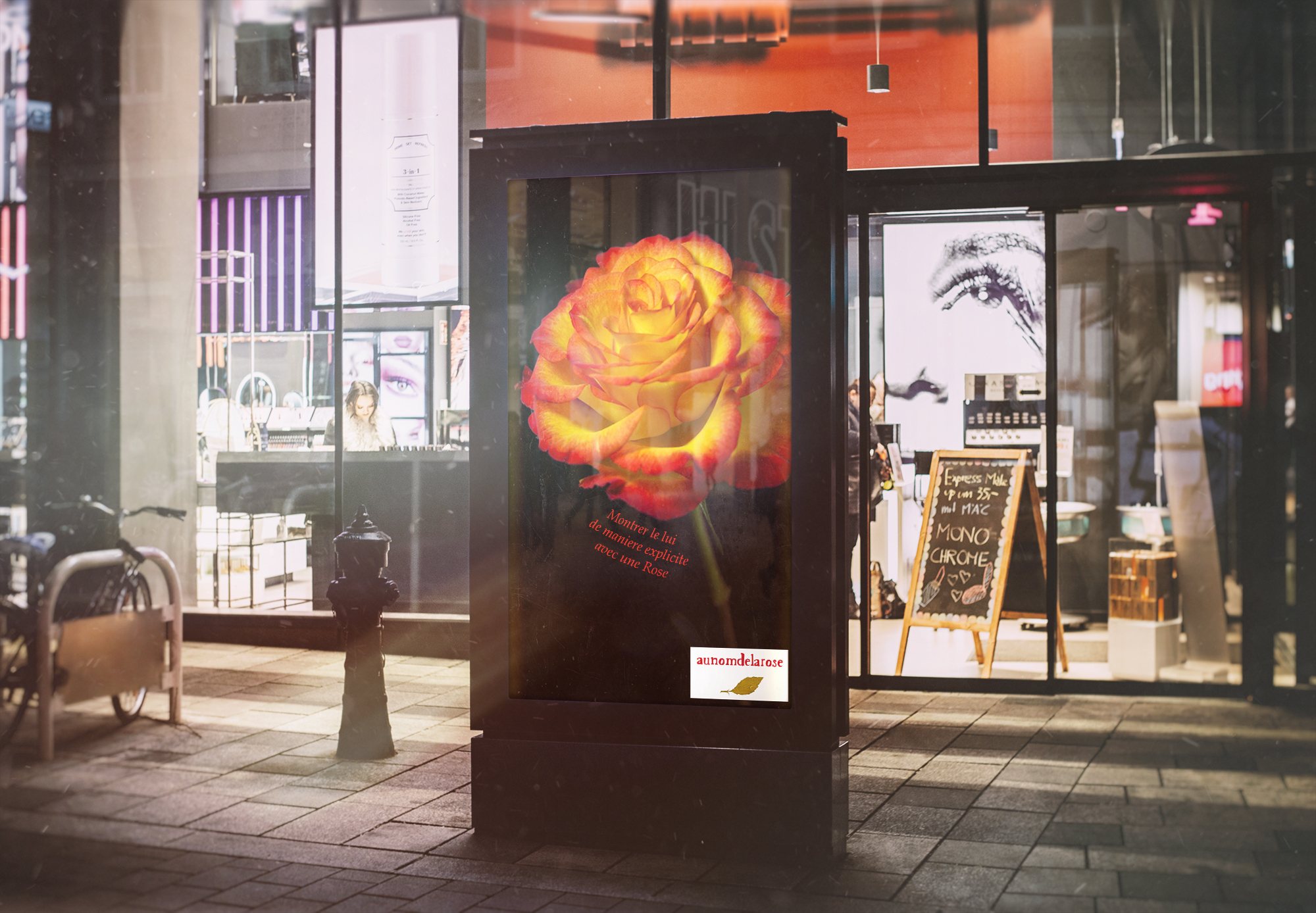
Shopping street
The orange visual mounted on street furniture in daylight. The saturation of the flower cuts through the grey of its setting — which is exactly what the colour decision is for.
Storefront, at night
The same set-up at night, with the plum visual. On a backlit screen, the pushed colours gain even more presence.
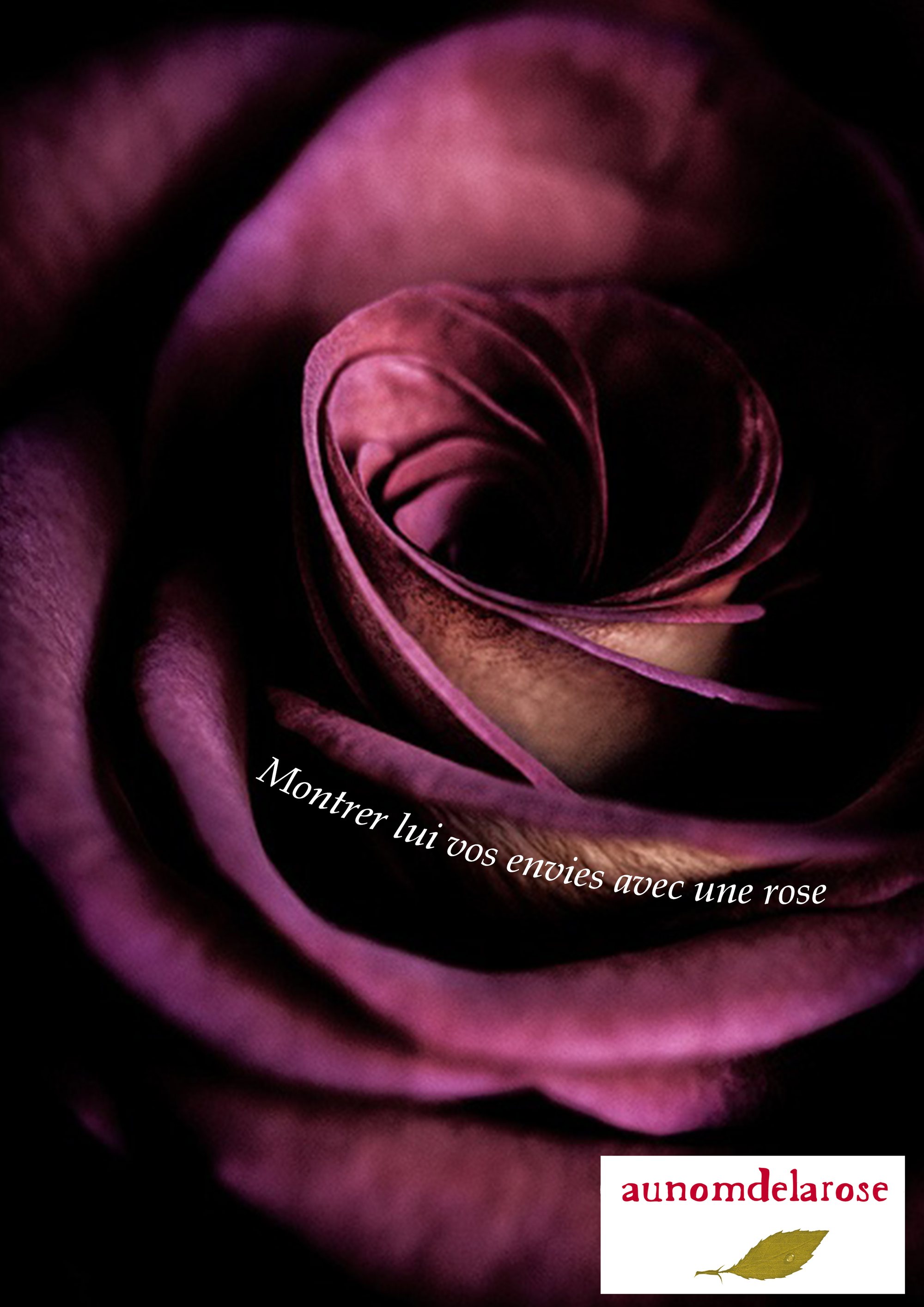
“Show them what you want”
A tight macro on the heart of the rose. The handwritten line follows the curve of the petals rather than sitting horizontally.
“A symbol of passion”
A wider crop on a sea-green ground — the complement of the petals’ magenta, which makes both colours vibrate.
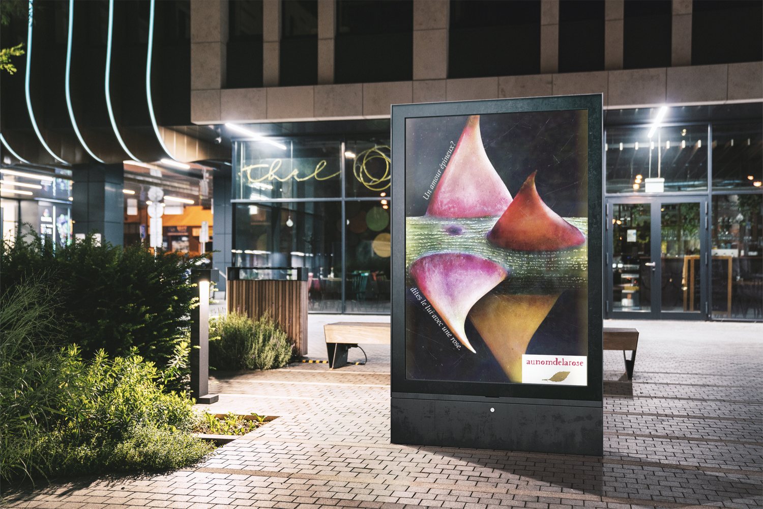
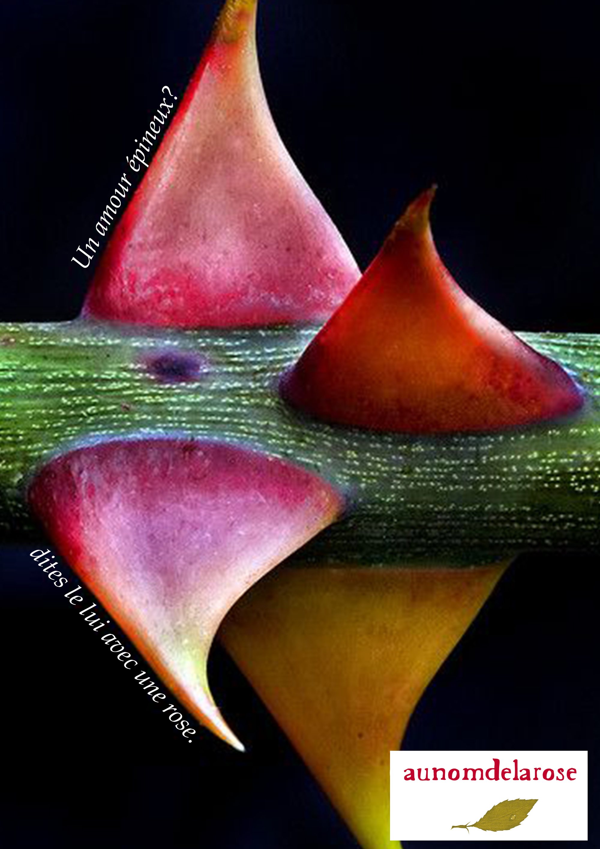
“A thorny love?”
A mirrored composition on a laid-down stem: symmetry replaces the whole flower here — the only image in the series to break from the classic portrait.
“Explicitly”
The orange rose cut out on black, the only image in the series without a setting. The line runs diagonally down the stem.
In short
Four visuals,
one mechanic.
The series works because the logotype’s position and the handwritten italic never move, whatever the colour of the ground.
Au Nom De La Rose