The Project
Three articles,
one mark.
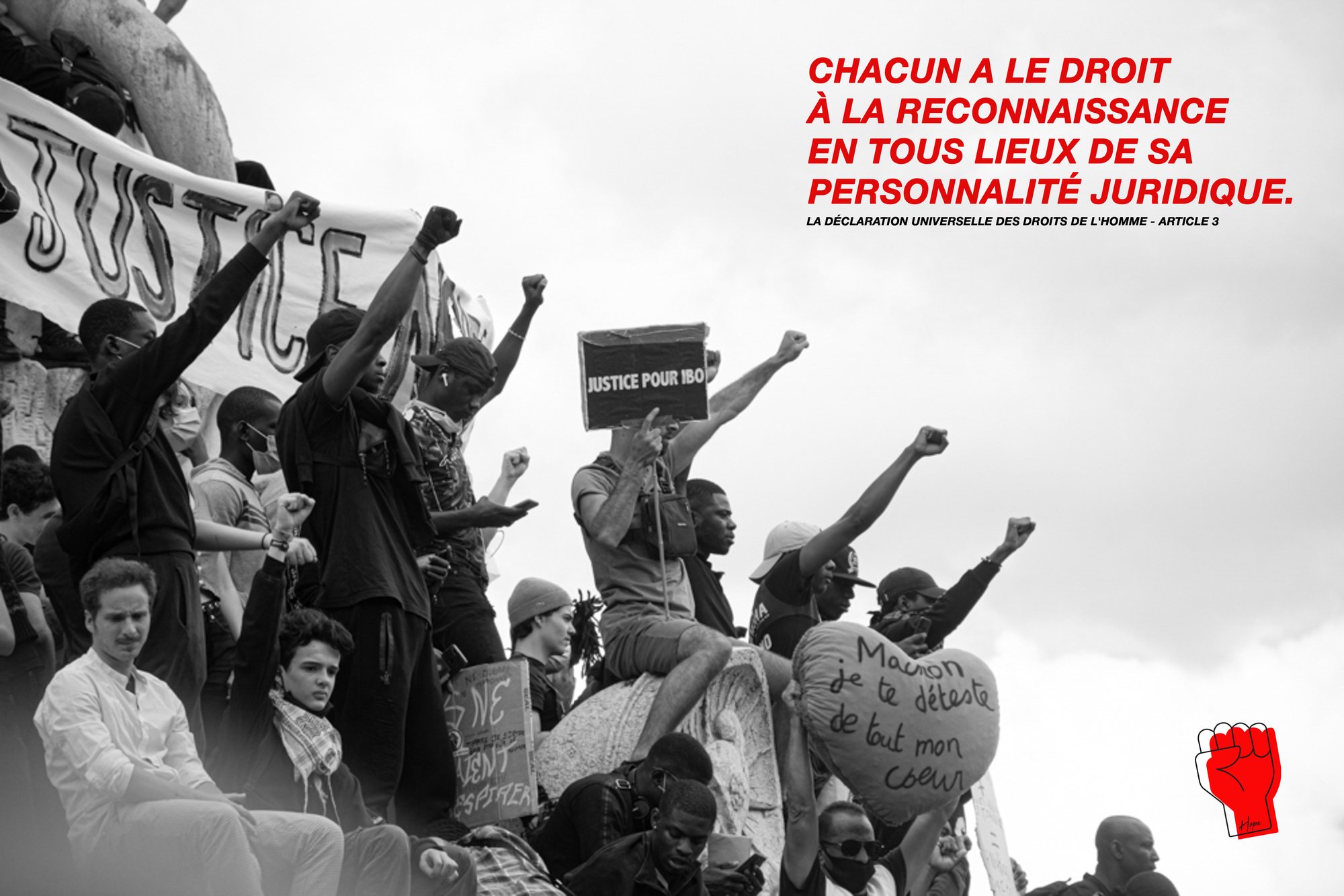
Hope takes the text of the Universal Declaration of Human Rights and gives it a single graphic form: a red raised fist, drawn as an outline, signed by hand.
The posters quote articles 1, 2 and 3 of the text, set in condensed caps over protest photography treated in black and white. Red appears once per poster, on the mark alone — which makes it the single point of entry into the image.
My Role
The mark is designed to survive reduction. Applied as embroidery on caps, screen print on t-shirts and print on face masks, it stays legible at every size because it rests on nothing but an outline and a flat fill.
01
Concept & Positioning
02
Mark Design
03
Typographic Layout
04
Photographic Treatment
05
Product Applications
Building the Identity
One red, one black, one white.
No half-tones in the system: the photographs are desaturated so the red stands alone.
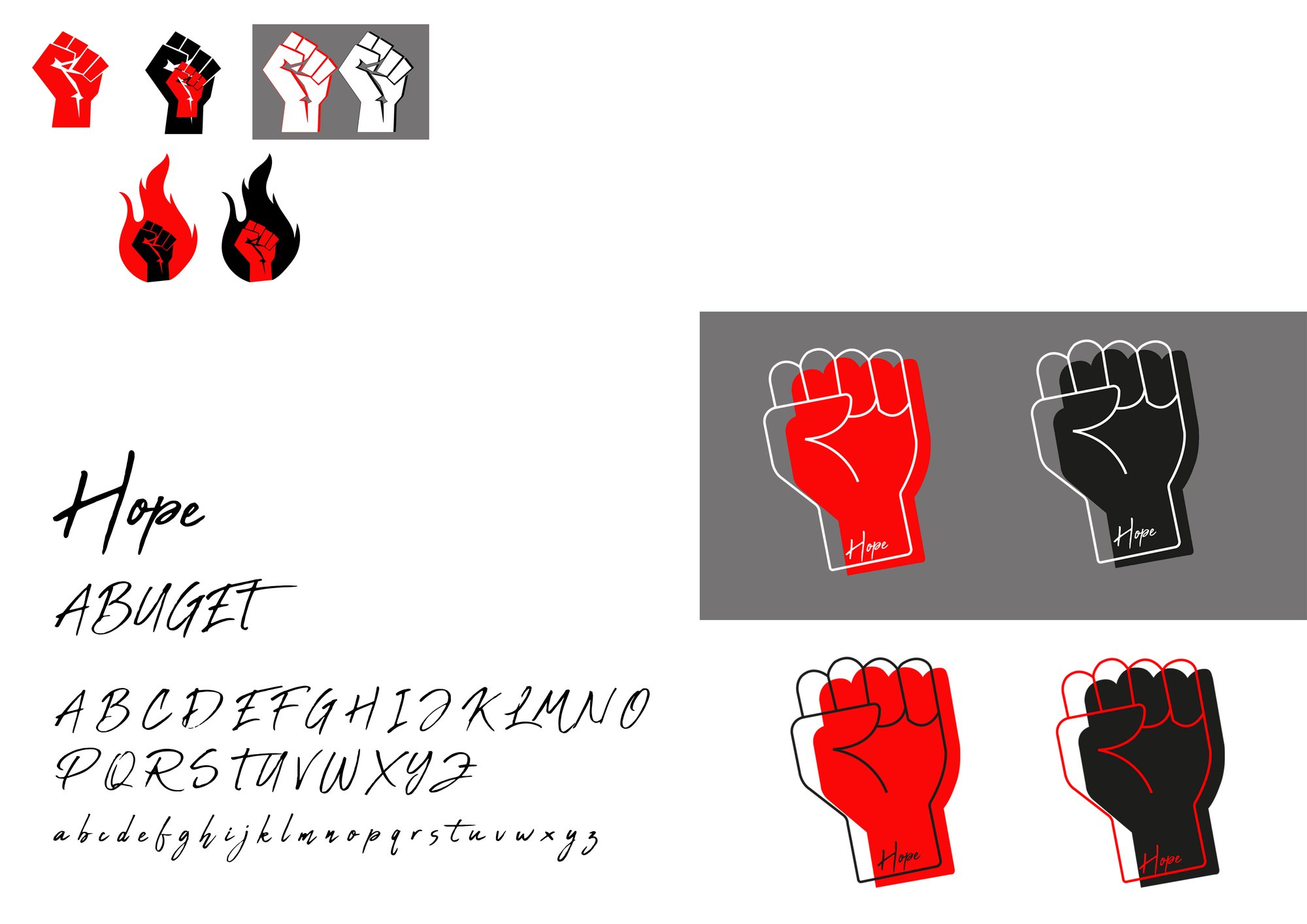
Palette sampled from the project’s own visuals.
The handwritten signature is set in Abuget, as noted on the brand sheet. The specimen above uses a stand-in typeface.
The Decision
The text has been written since 1948. The work was making it visible.
The Work
In detail.
In situ
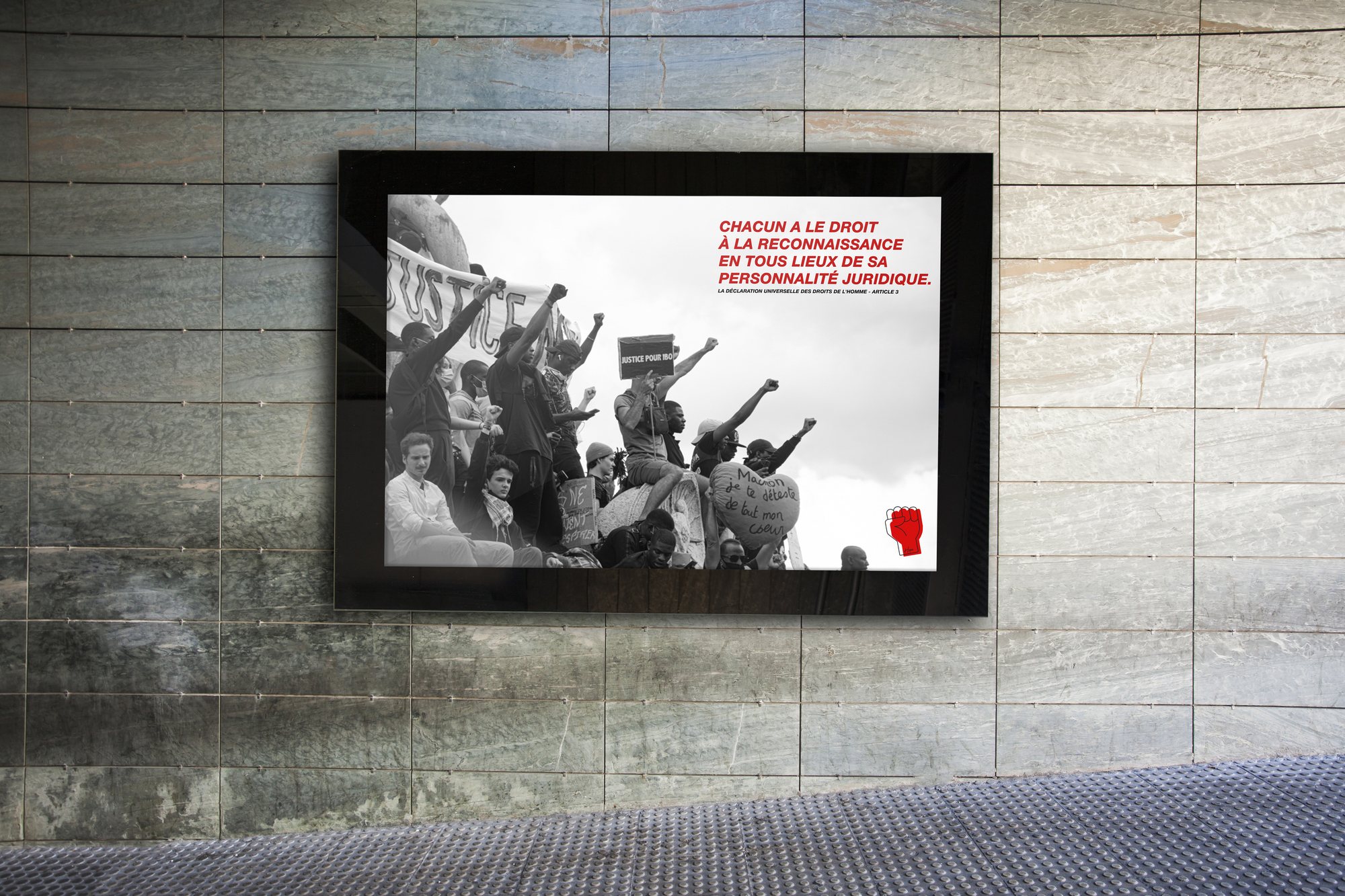
The poster mounted on an urban wall. The horizontal format lets the photograph run the full width and pushes the text into the corner.
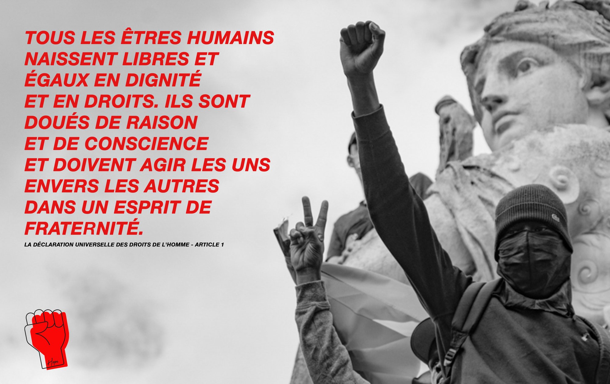
Article one
“All human beings are born free and equal in dignity and rights.” The text block is set flush left in condensed caps, the photograph fills the right half, and the mark anchors the lower-left corner.
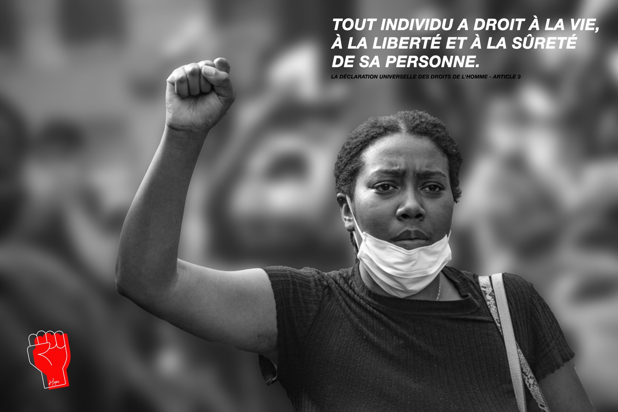
Article three
“Everyone has the right to life, liberty and security of person.” Here the text moves to the upper right and the photograph is thrown out of focus behind, to isolate a single gesture.
Article six
The third composition in the series, on a light ground this time: the text goes red and the mark returns to the foot of the poster.
The mark system
The sheet gathers the mark’s states — red, black, outline, flame variant — alongside the handwritten signature and the display alphabet. This is the document that makes the campaign deployable.
Apparel
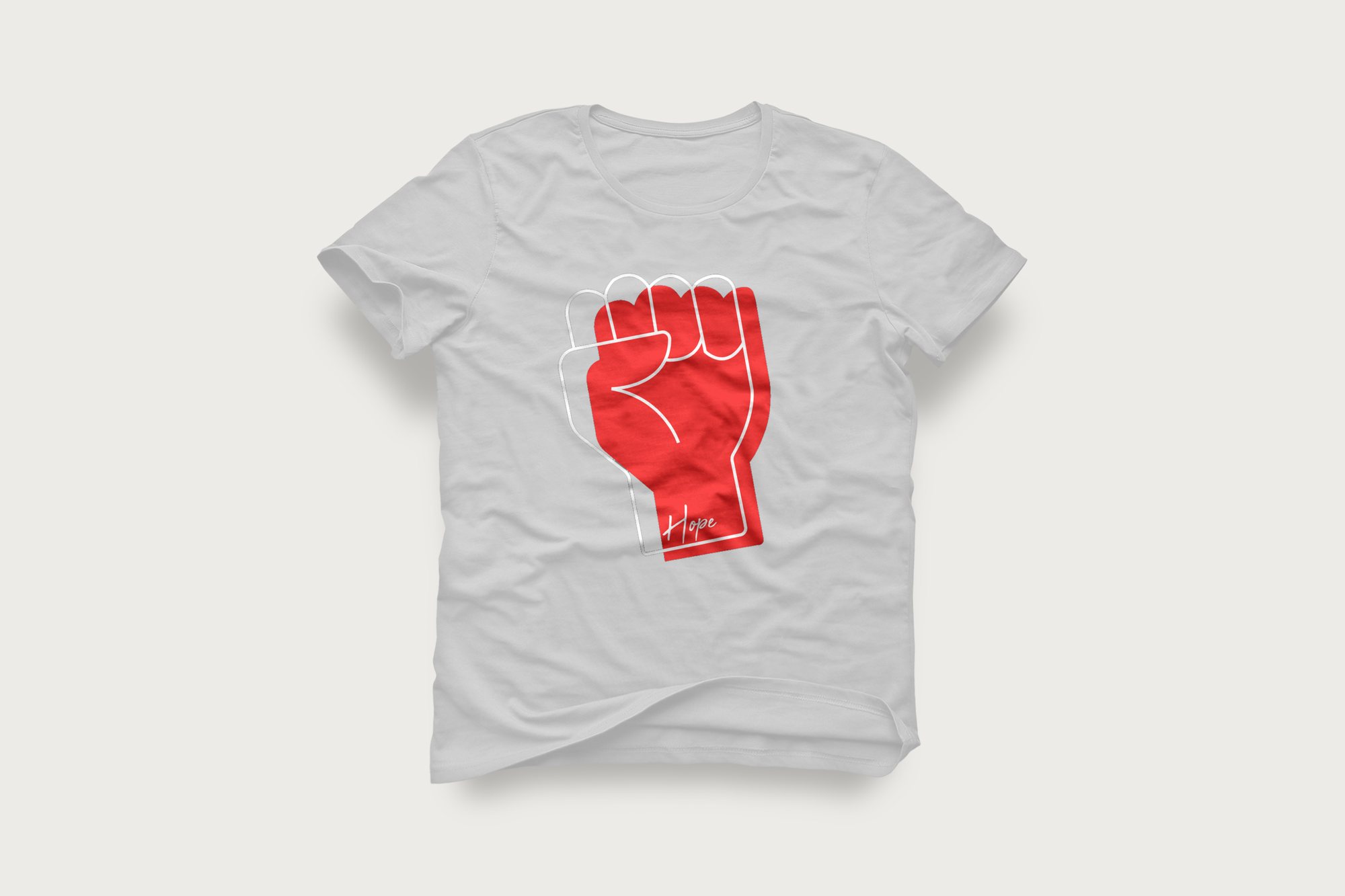
On a t-shirt the mark is printed large, offset from its black outline — the shift creates relief without adding a colour.
Cap
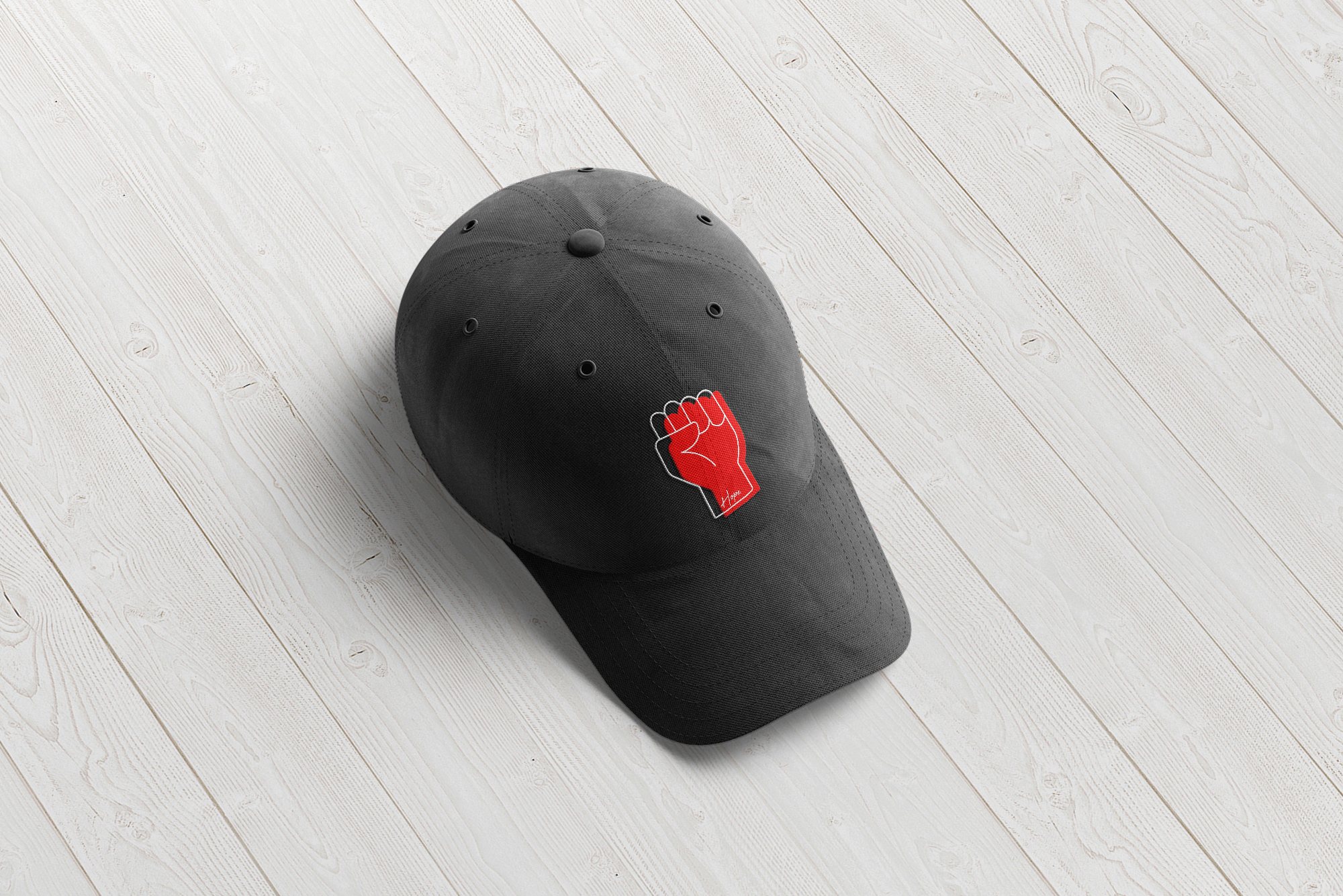
Embroidered at a few centimetres: the outline holds, which validates the drawing of the mark.
Face mask
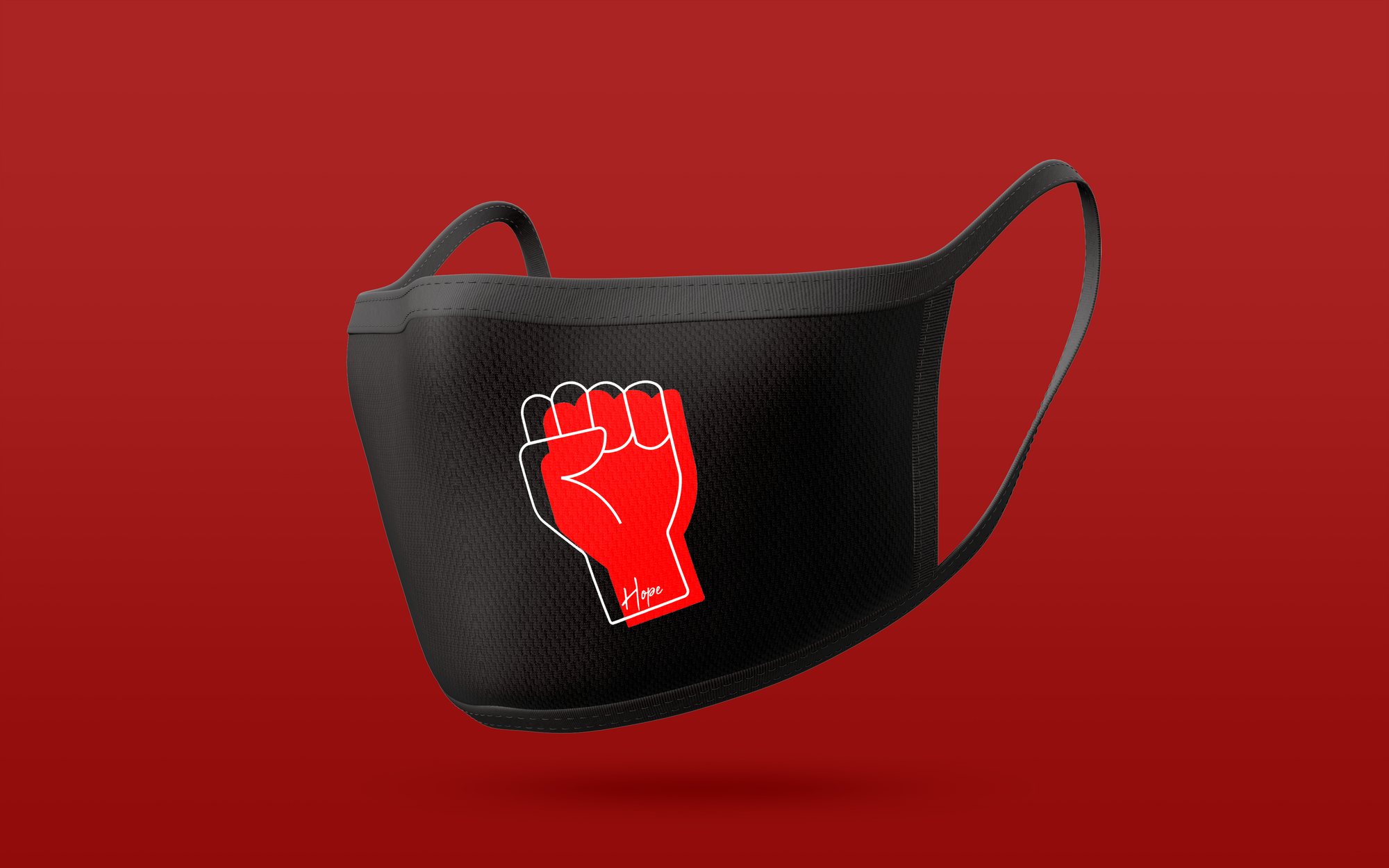
The last application in the series, dated 2020: the mark reversed black on red, and red on black.
In short
A mark that holds
from billboard to lapel.
The starting constraint — one red, one gesture — is also what lets the campaign extend without ever thinning out.
Hope