The Project
Wood handled
like a luxury product.
Wooden is a furniture and interiors brand. The identity rests on a single contrast: warm gold on near-absolute black.
The logotype is set in University Roman, a narrow, high-contrast serif. One variant runs a horizontal rule through the word, linking the two Os — the detail that separates the brand from a word simply placed.
My Role
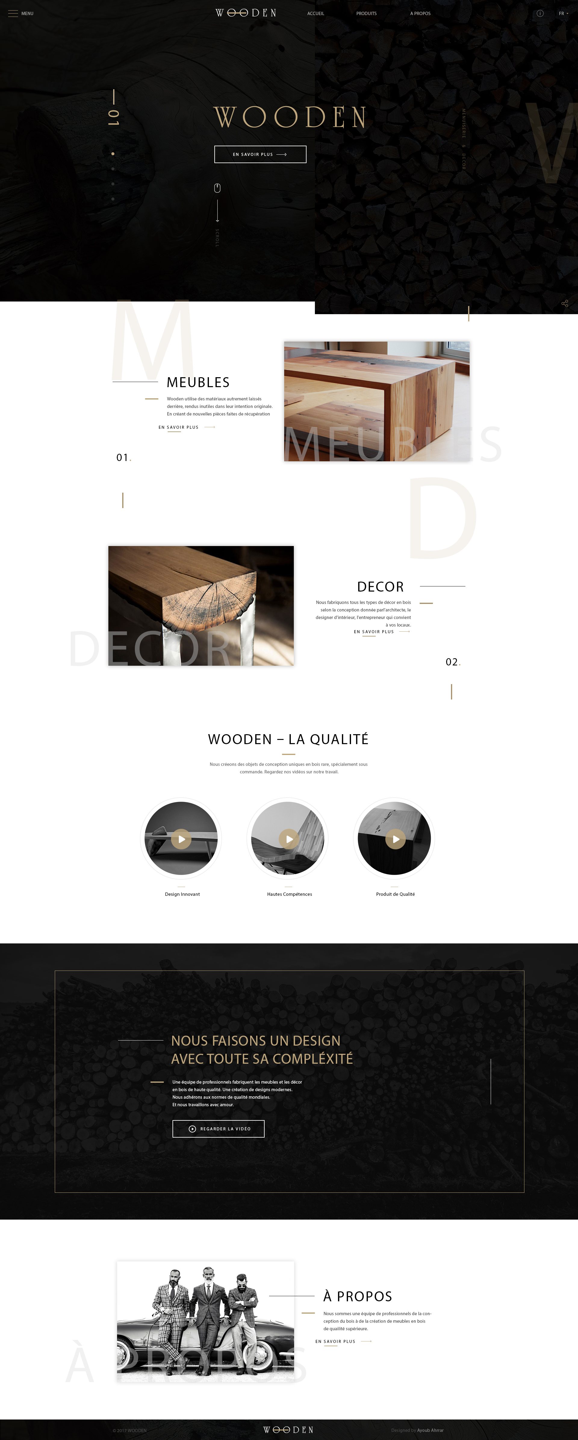
The site follows the same economy: a dark, patterned homepage, two entry points only — Furniture and Interiors — then a quality section and an about page. The navigation never offers more choice than is needed.
01
Logotype
02
Colour System
03
Page Architecture
04
Interface Design
05
Mockups
Building the Identity
One gold, one black, nothing between.
The project’s guidelines declare two values and one typeface. Everything else on the site follows from them.
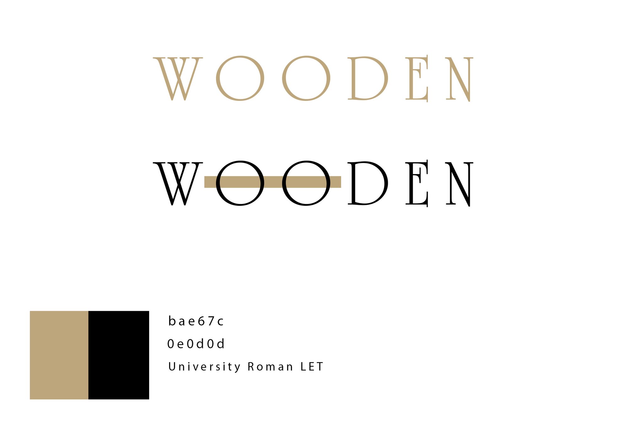
Values as declared in the project’s own guidelines.
The specimen above uses a stand-in typeface; the original logotype is set in University Roman LET.
The Decision
Two entry points, one promise, no distractions.
The Work
In detail.
The full page
Top to bottom: a dark patterned hero where the logotype stands alone, two category blocks — Furniture and Interiors — crossed by oversized ghosted letters, a quality section in three thumbnails, a commitment band and then the about page.
In context
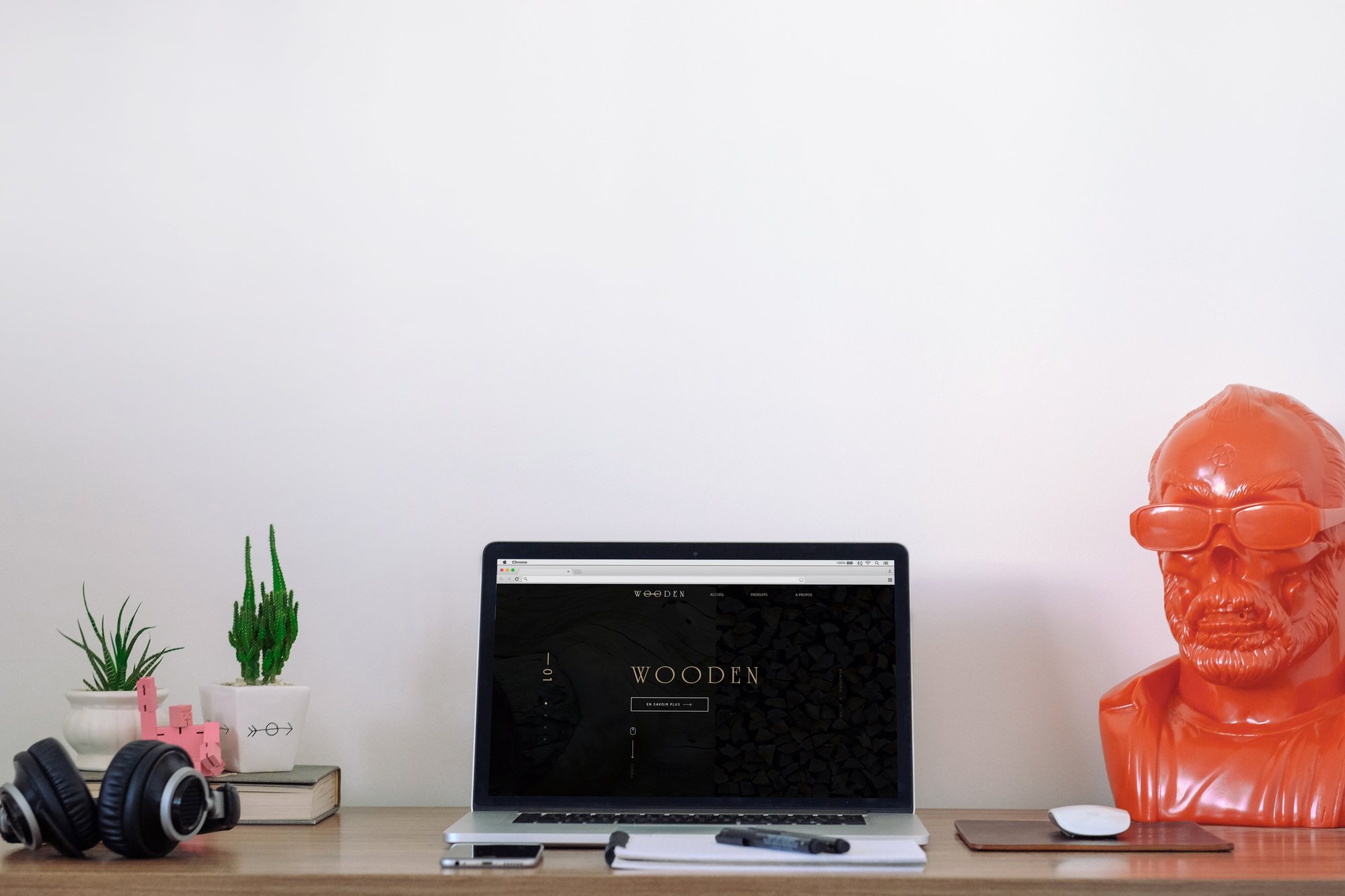
The site seen on a real desk. The hero’s very high contrast stays readable from a distance, which was the point of the colour choice.
The logotype
The two states of the logotype — gold version and ruled version — alongside the palette and the typographic reference. A document that fits on one page.
In short
A material brand,
handled in black and gold.
Maximum contrast was the project’s bet: it gives the photographed furniture a presence a light interface would not have left it.
Wooden