The Project
A spine that vibrates,
pages that stay quiet.
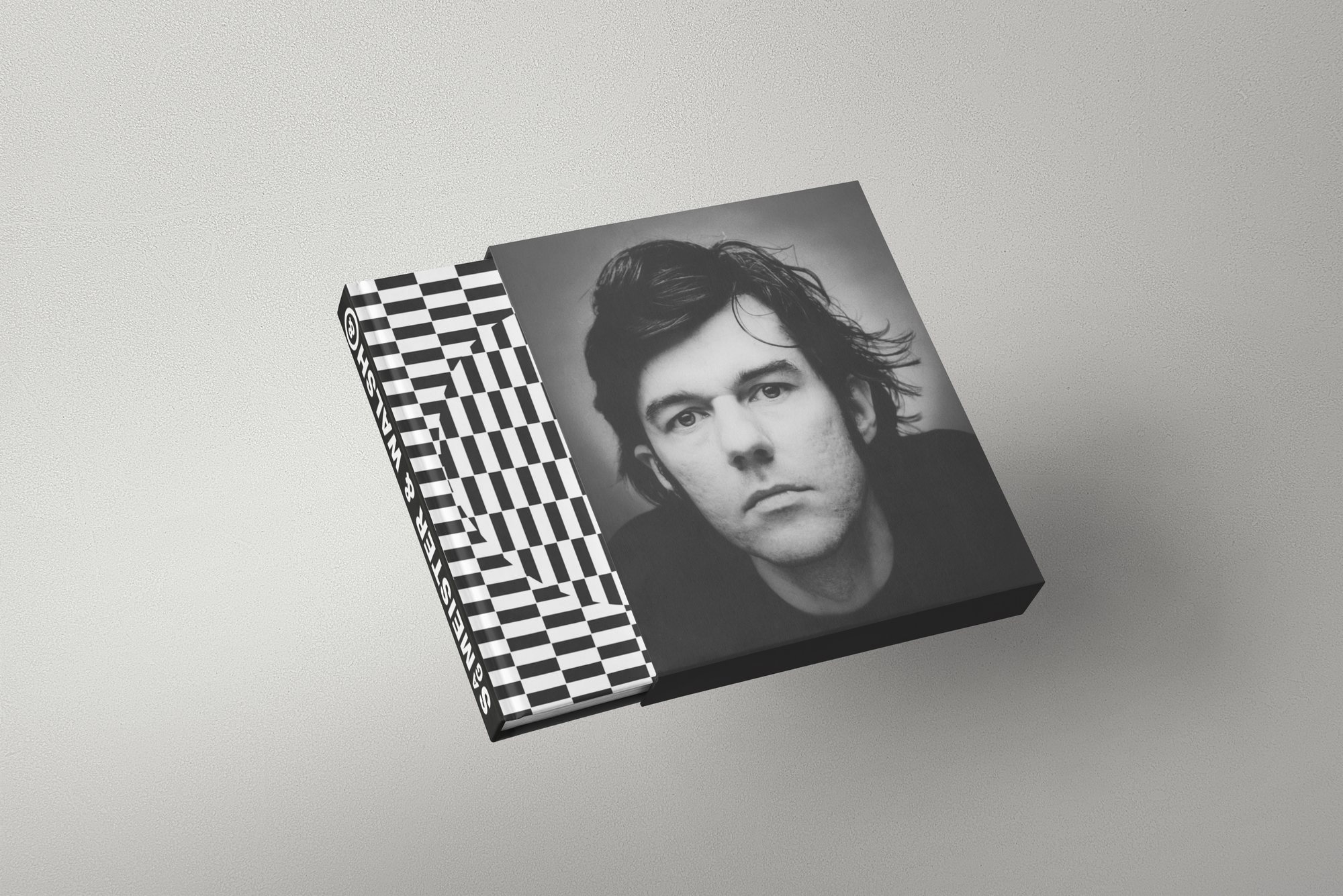
A monograph on the studio Sagmeister & Walsh, built around a single production idea: the cover is wrapped in a black-and-white optical pattern that runs over onto the spine.
The warped checkerboard nods to the studio’s work without quoting it. On the front it gives way to a tightly cropped black-and-white portrait: the tension between the restless pattern and the still portrait is the whole object.
My Role
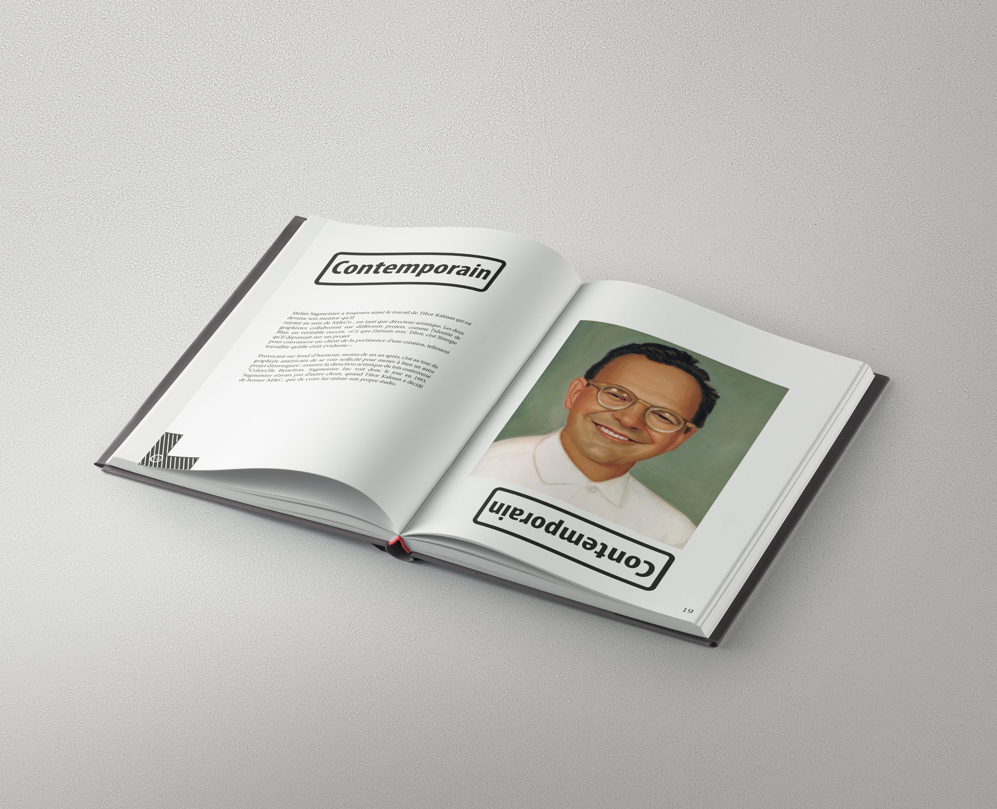
Inside, the layout inverts the rule: the ground returns to white, headings are boxed in black cartouches, and colour images sit isolated in the text. Only one page of any spread is ever loaded.
01
Editorial Concept
02
Cover Pattern
03
Grid & Layout
04
Portrait Treatment
05
Production
Building the Identity
Black, white, and one colour allowed in.
The colour system is limited to ink: colour appears only inside the reproduced images.
Palette sampled from the project’s own visuals.
The Decision
The pattern makes the noise, the grid makes the silence.
The Work
In detail.
The cover
The male portrait fills the front, the optical pattern wraps the spine and spills onto the edge. The cover carries no title: the object is recognised by its spine.
The second cover
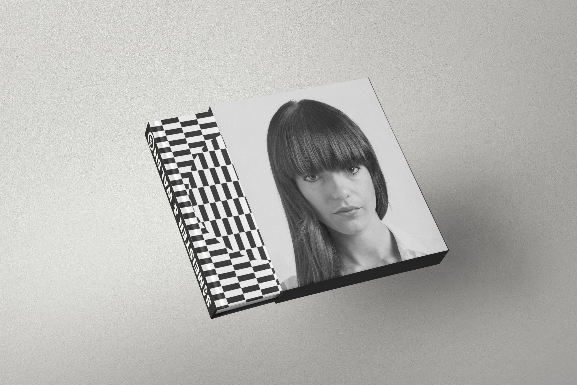
The second portrait in the pair. The same template takes a different crop, which allows a variant without redrawing the cover.
The spread
Inside, the word “Contemporain” is repeated in a cartouche on either side of the fold, once upright and once inverted — the layout’s only flourish, and it serves the reading.
In short
An object recognised
by its edge.
Designing a book about a studio known for excess called for a restrained answer: the pattern takes all the noise, the pages keep none of it.
Sagmeister & Walsh