The Project
Simple, honest,
lasting beauty.
ORA Skincare is a premium natural skincare brand, built to embody a simple, honest and lasting idea of beauty.
The project explores a minimal, contemporary art direction that brings together elegant typography, an organic palette and pared-back design. The visual world rests on soft tones — beige, deep brown — to reflect the purity of the formulas and the warmth of natural materials.
My Role
The identity is carried by a refined logo pairing a classical serif with quiet modernity, a soft and sensory set of guidelines, a clear, immersive e-commerce homepage, and product staging drawn from the codes of natural beauty.
01
Positioning & Territory
02
Logo & Signature
03
Colour System
04
Product Art Direction
05
E-commerce Homepage
Building the Identity
A brown serif, a warm beige, nothing more.
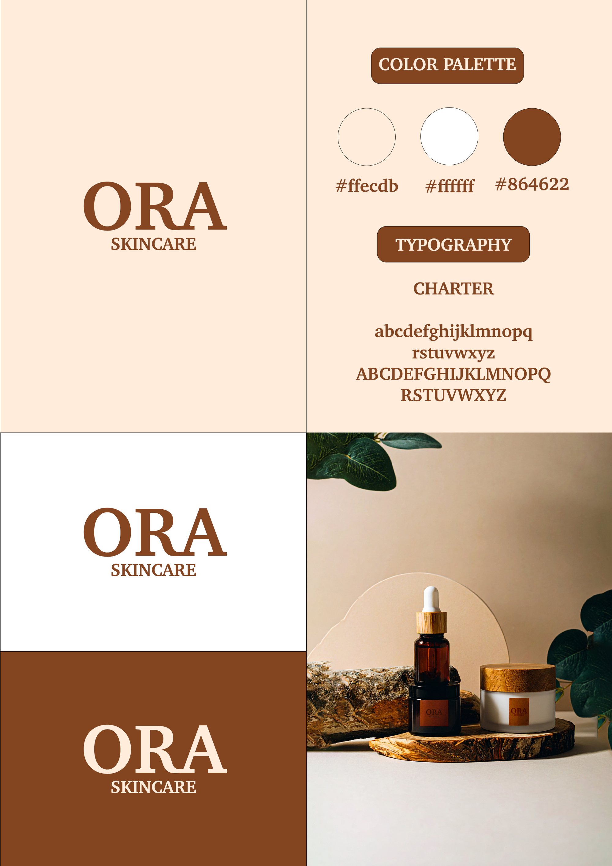
The system holds in three values and a single typeface. That economy is what gives the brand its calm.
Values as declared in the project’s own guidelines.
Charter — a transitional serif by Matthew Carter — carries the whole system: logo, headings and running text. The specimen above is set in a close stand-in.
The Decision
Quiet minimalism, sensory quality, ethical beauty.
The Work
In detail.
The homepage
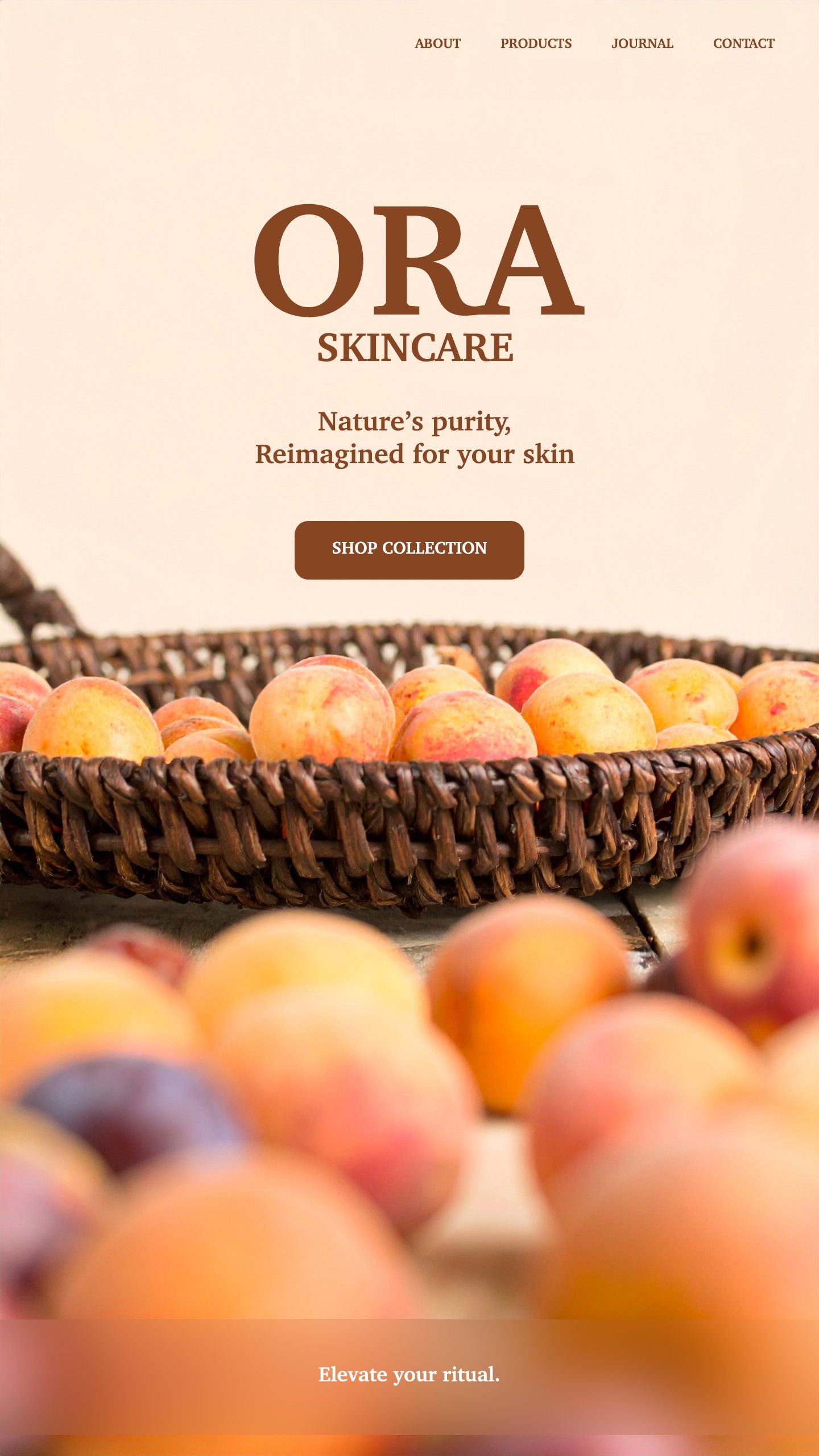
The brown serif logo, centred on soft beige, states the brand’s sober, honest identity. Behind it, an organic scene of fruit in a wicker basket evokes the freshness of the ingredients. The claim “Nature’s purity, reimagined for your skin” carries the promise, while a single call to action gives the interface its rhythm.
The guidelines
The logo is tested on all three grounds in the system — beige, white, brown — to check it holds in each situation. The board gathers the palette, the typeface and a product still on a single page: everything needed to roll the brand out.
The product
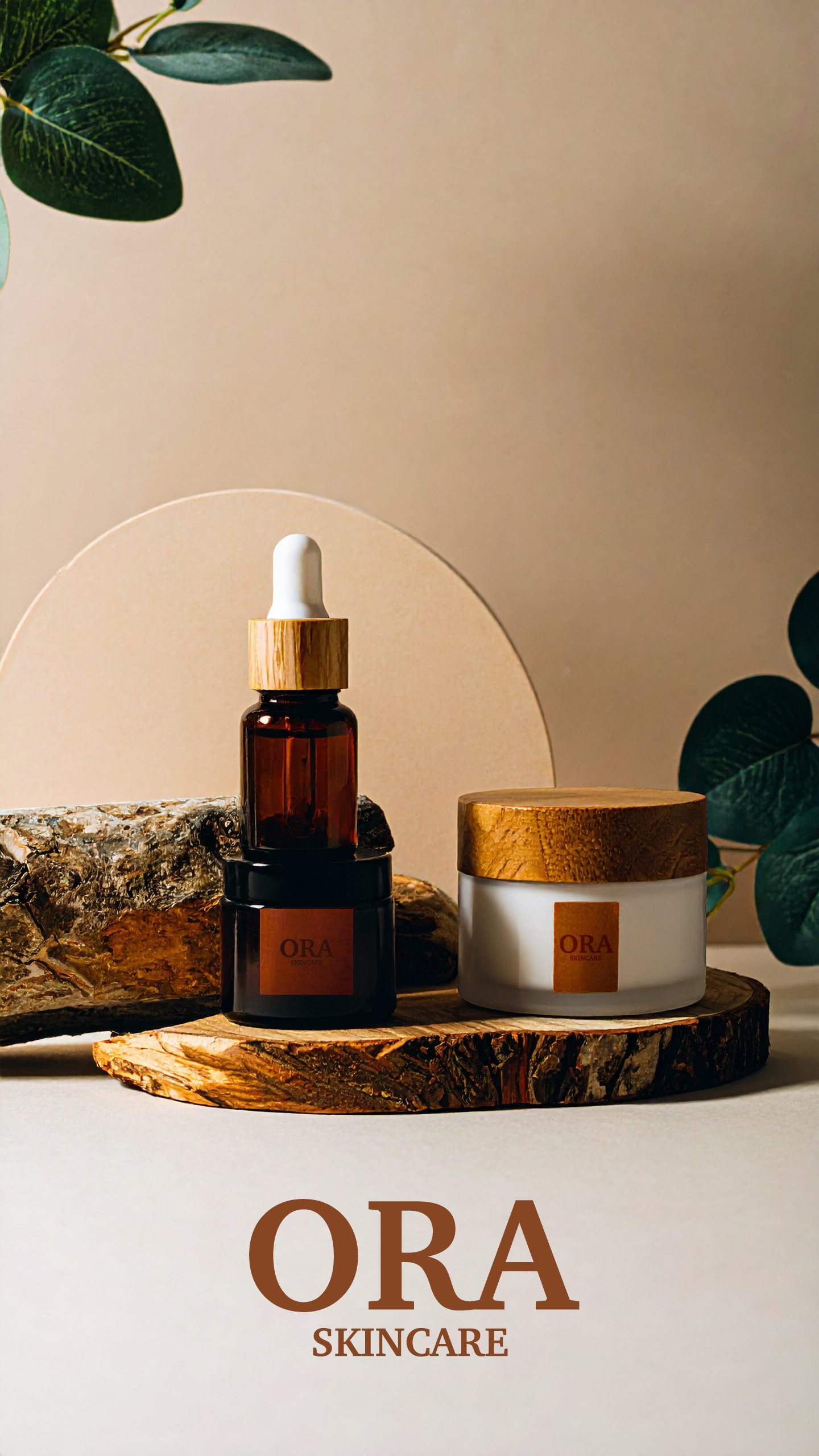
An amber dropper bottle and a white jar on a slice of wood, real foliage, soft raking light: the photography applies the brand promise literally rather than commenting on it.
In short
A brand that doesn’t exist,
held together as though it did.
The exercise was to push consistency all the way: from the mark to the photography, from the beige ground to the buy button, every element answers to the same chromatic and typographic brief.
ORA Skincare