Typography & Poster — 2013
Typographic Experiments
Three experiments
Alphabet design,
poster layout.
The Project
One constraint,
one alphabet.
Three exercises on the letterform, each starting from a rule that fits in one sentence: take matter away, assemble two colours, draw a face with an existing typeface.
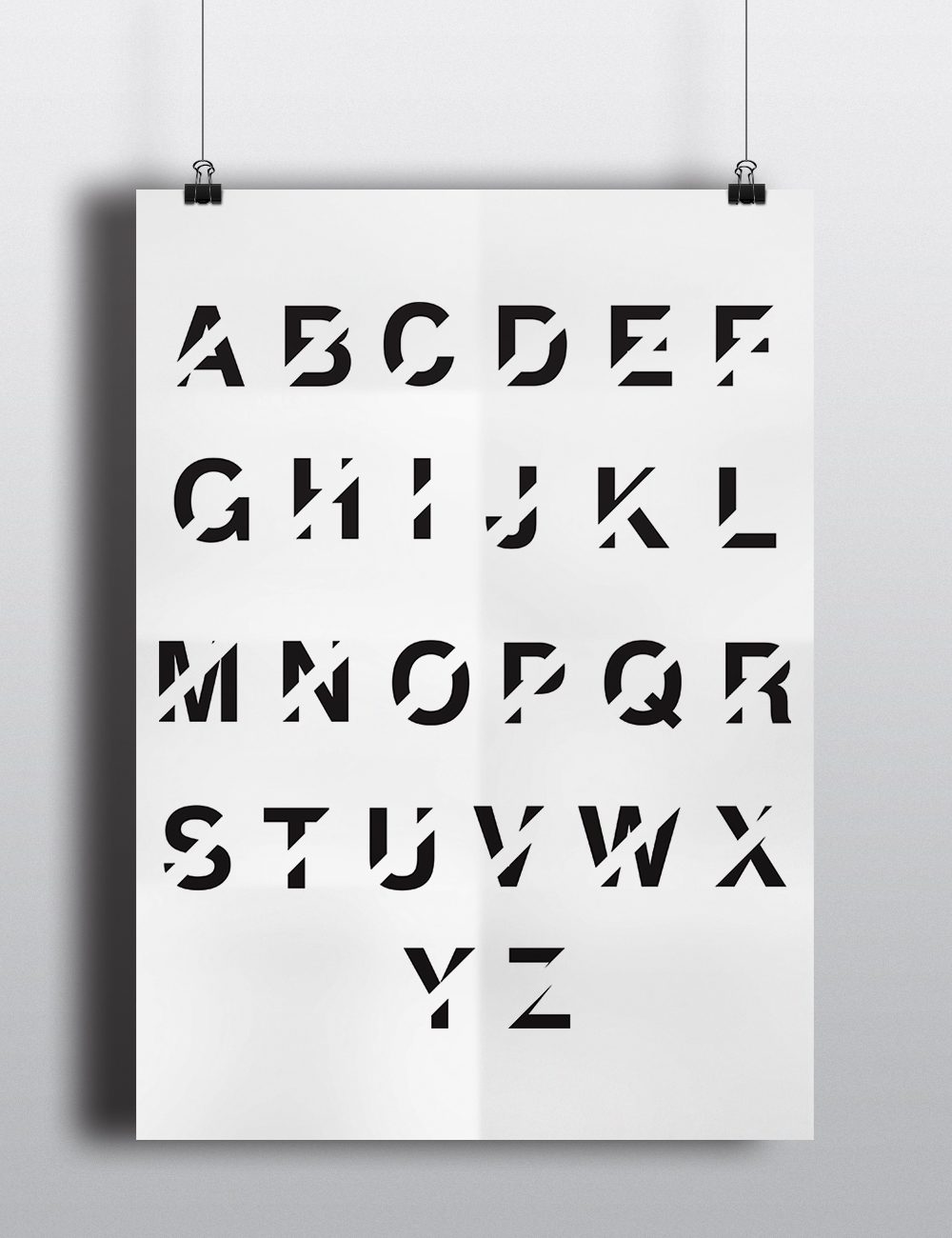
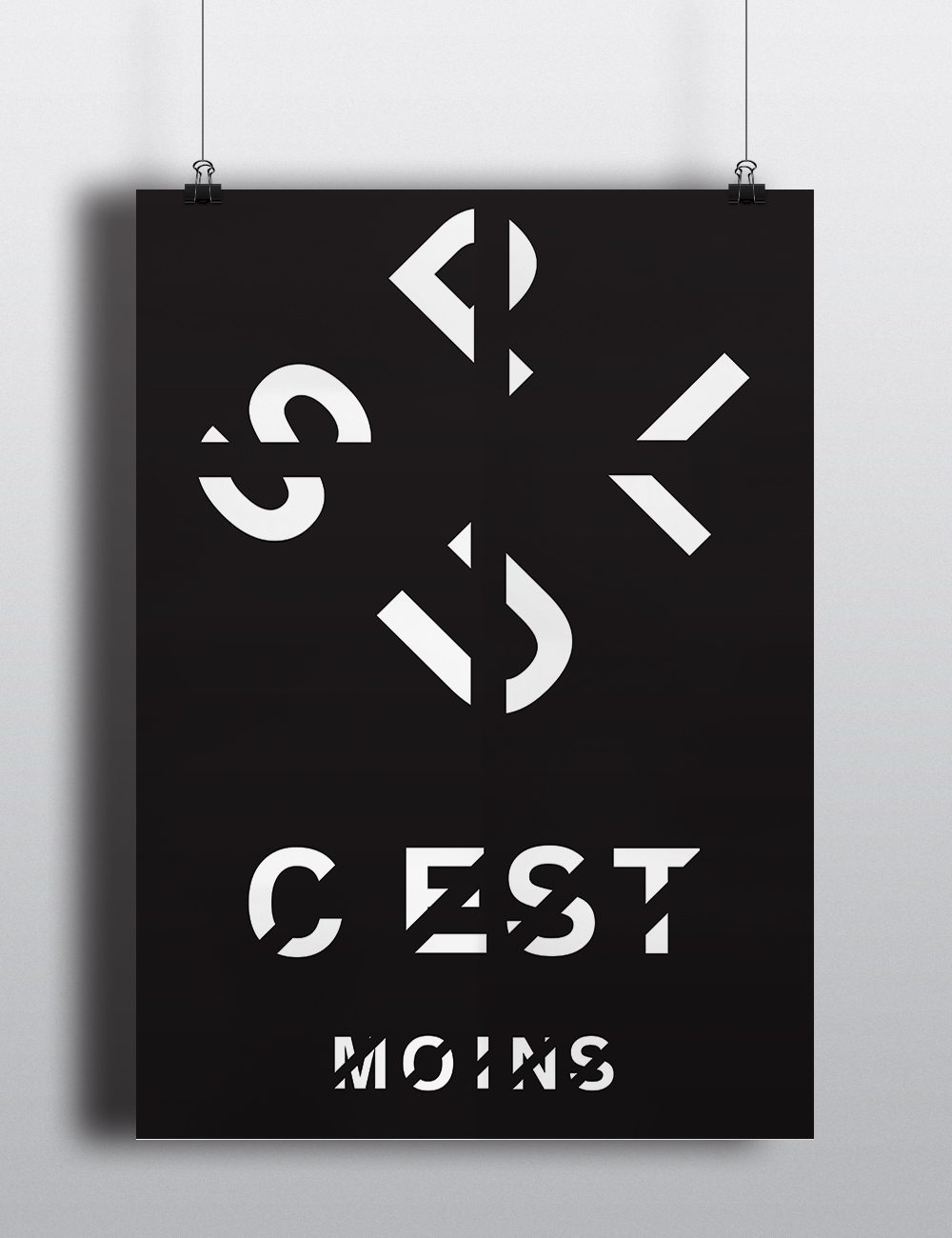
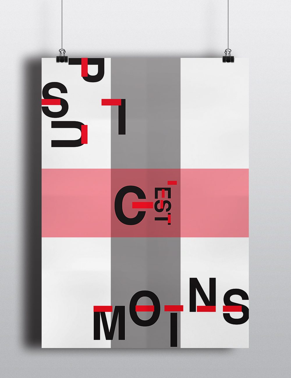
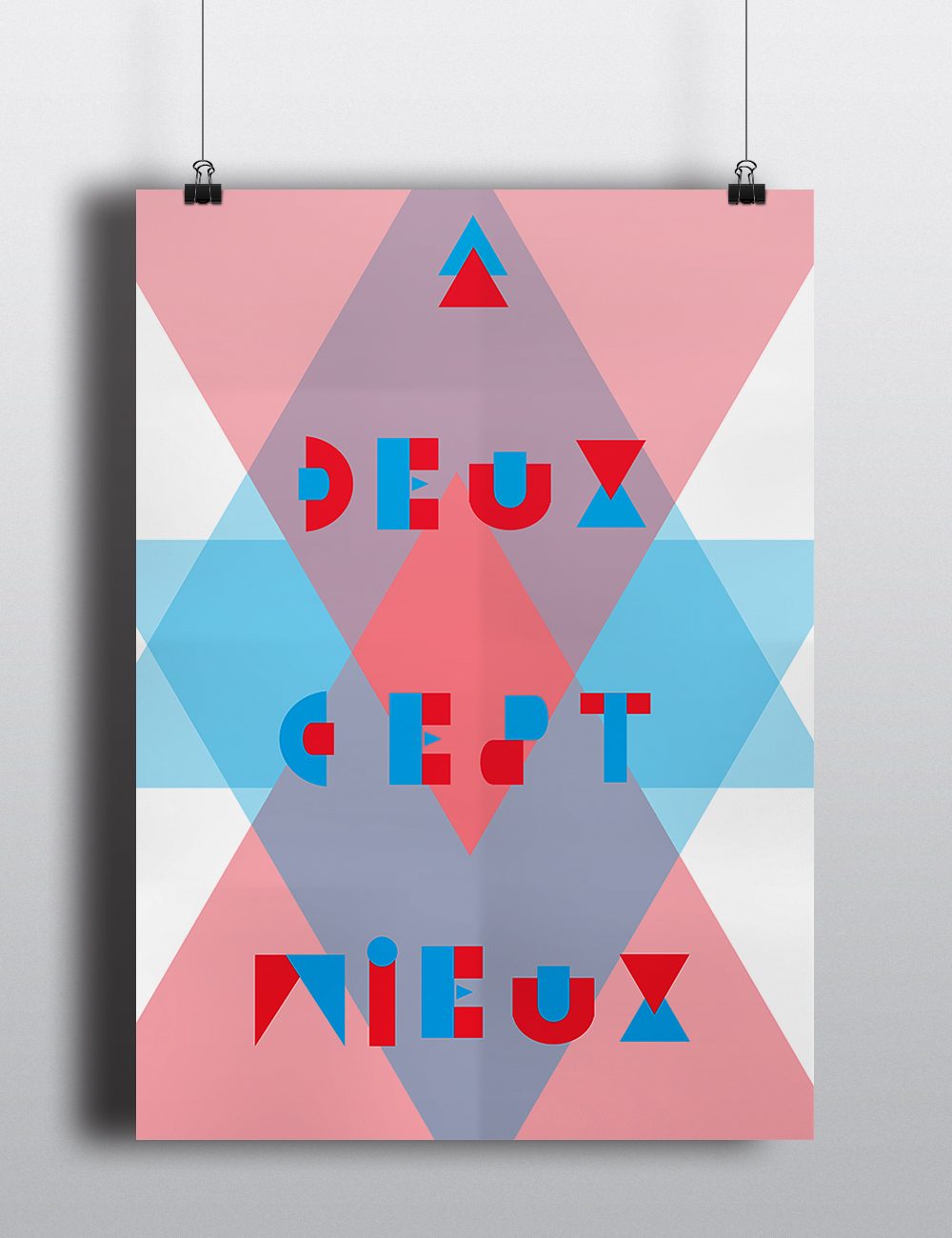
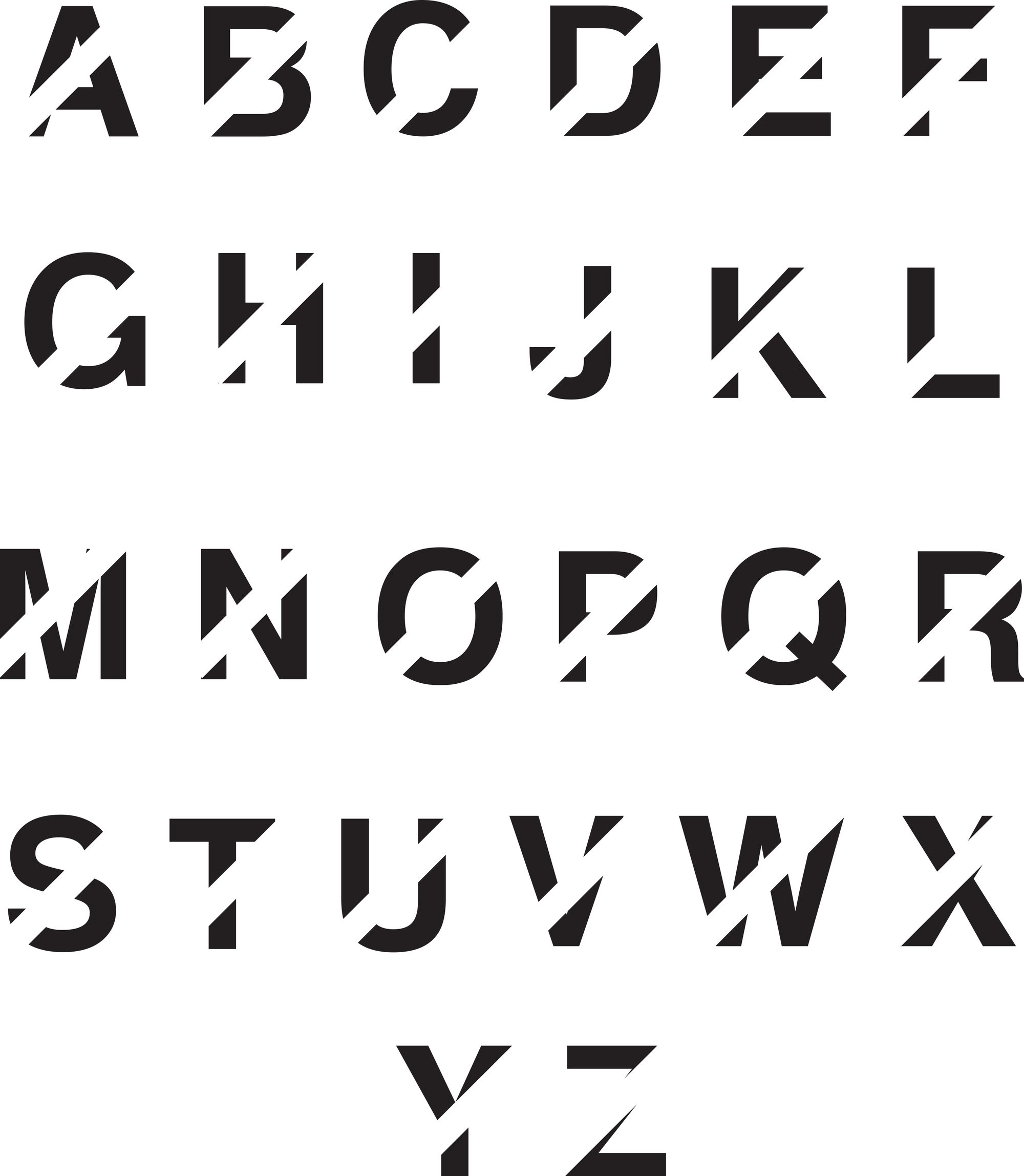
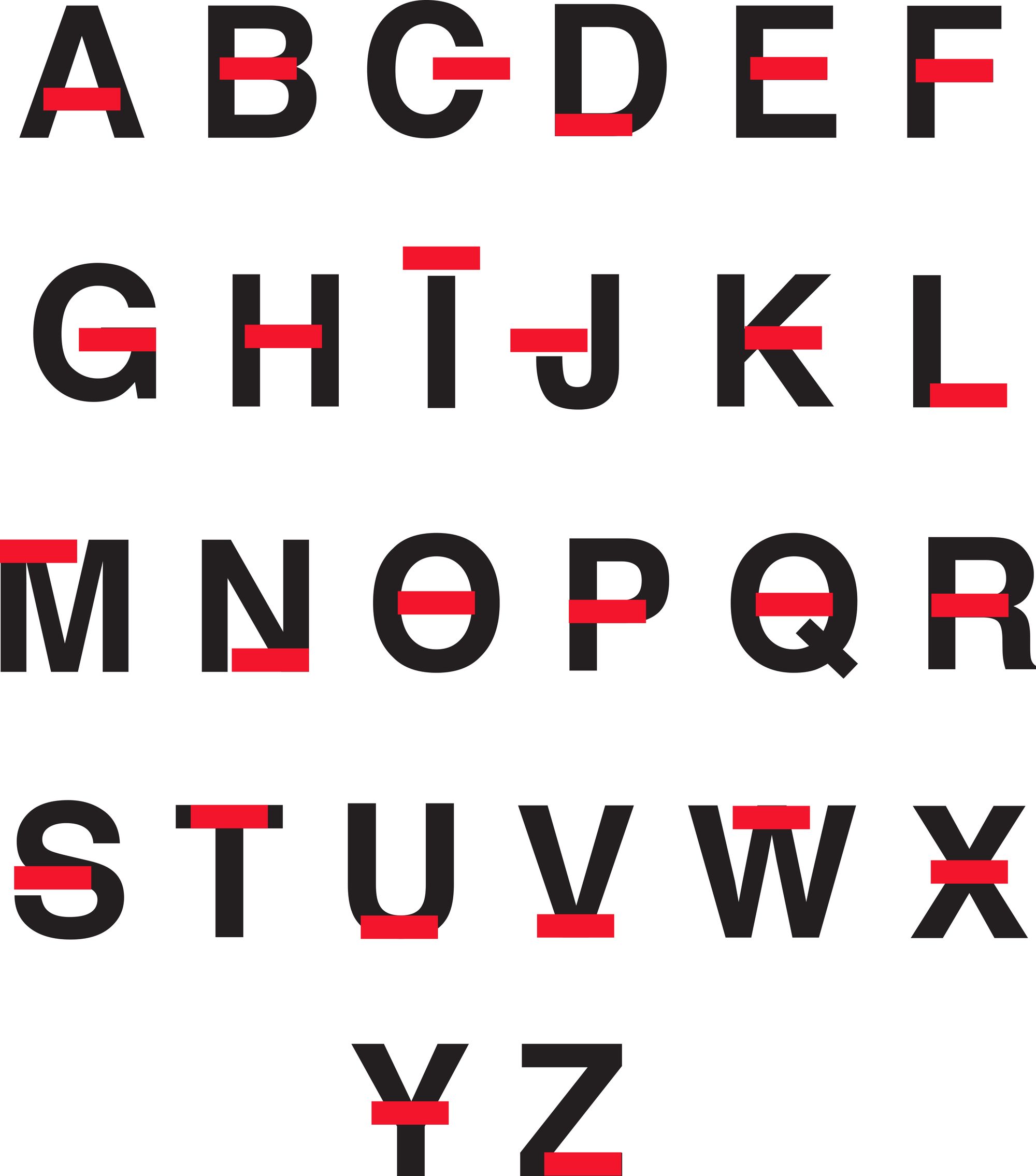
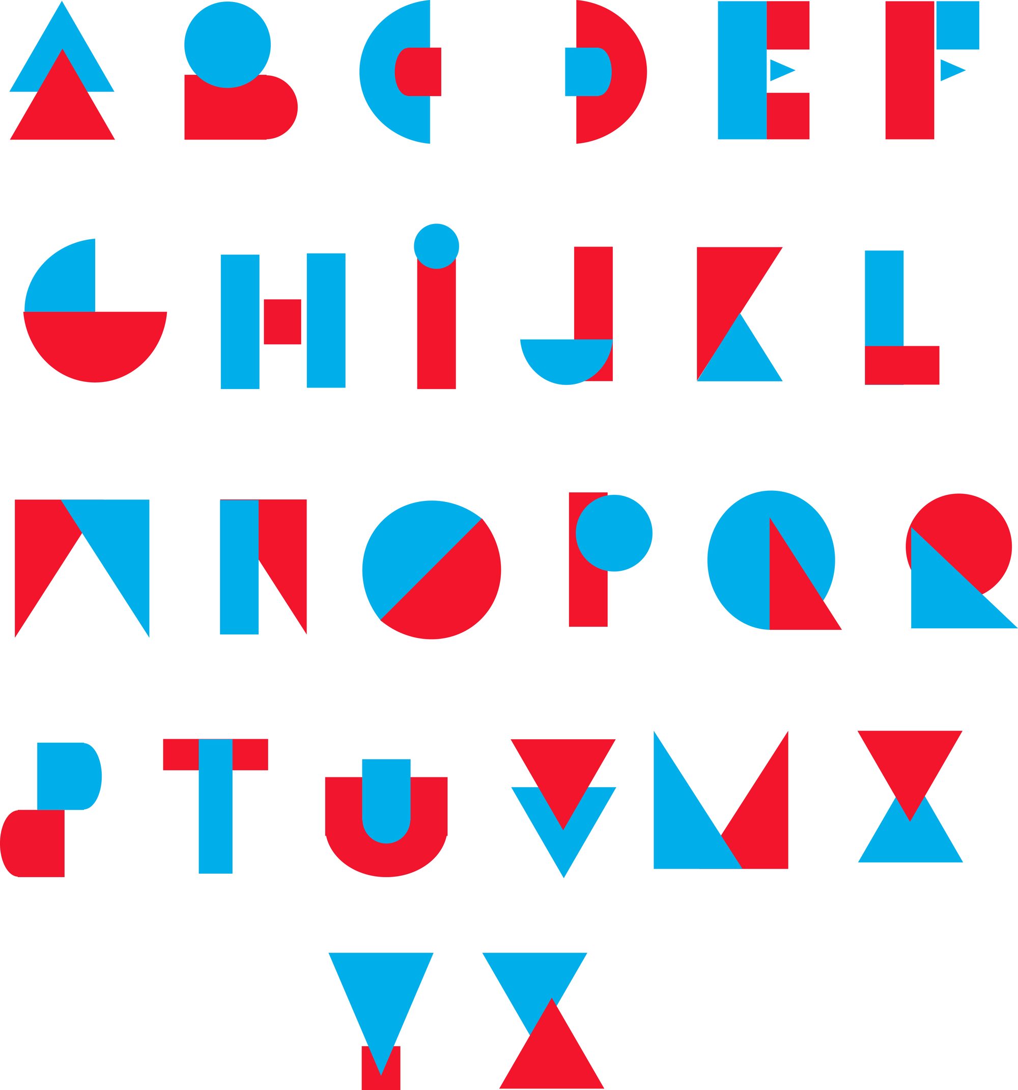
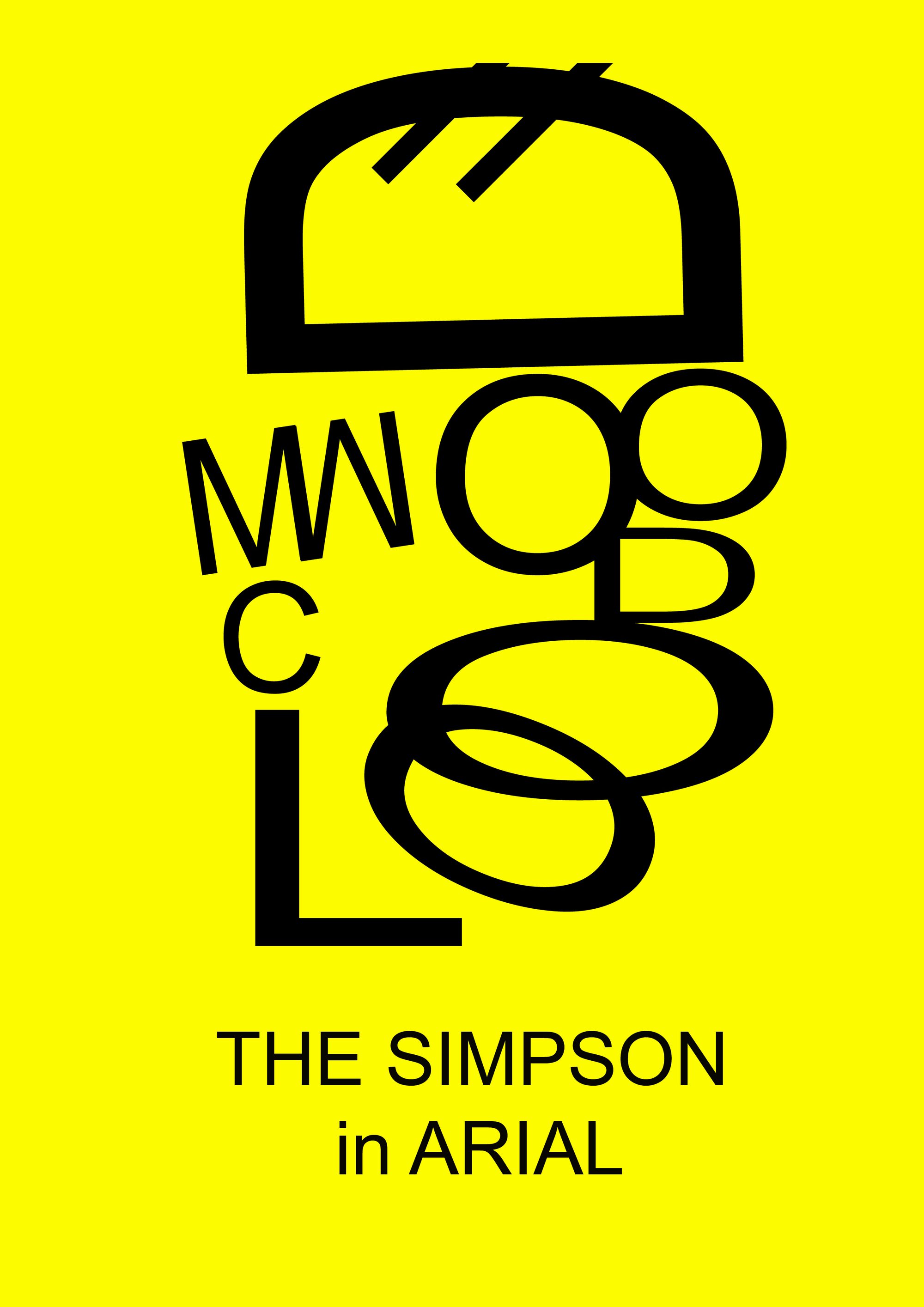
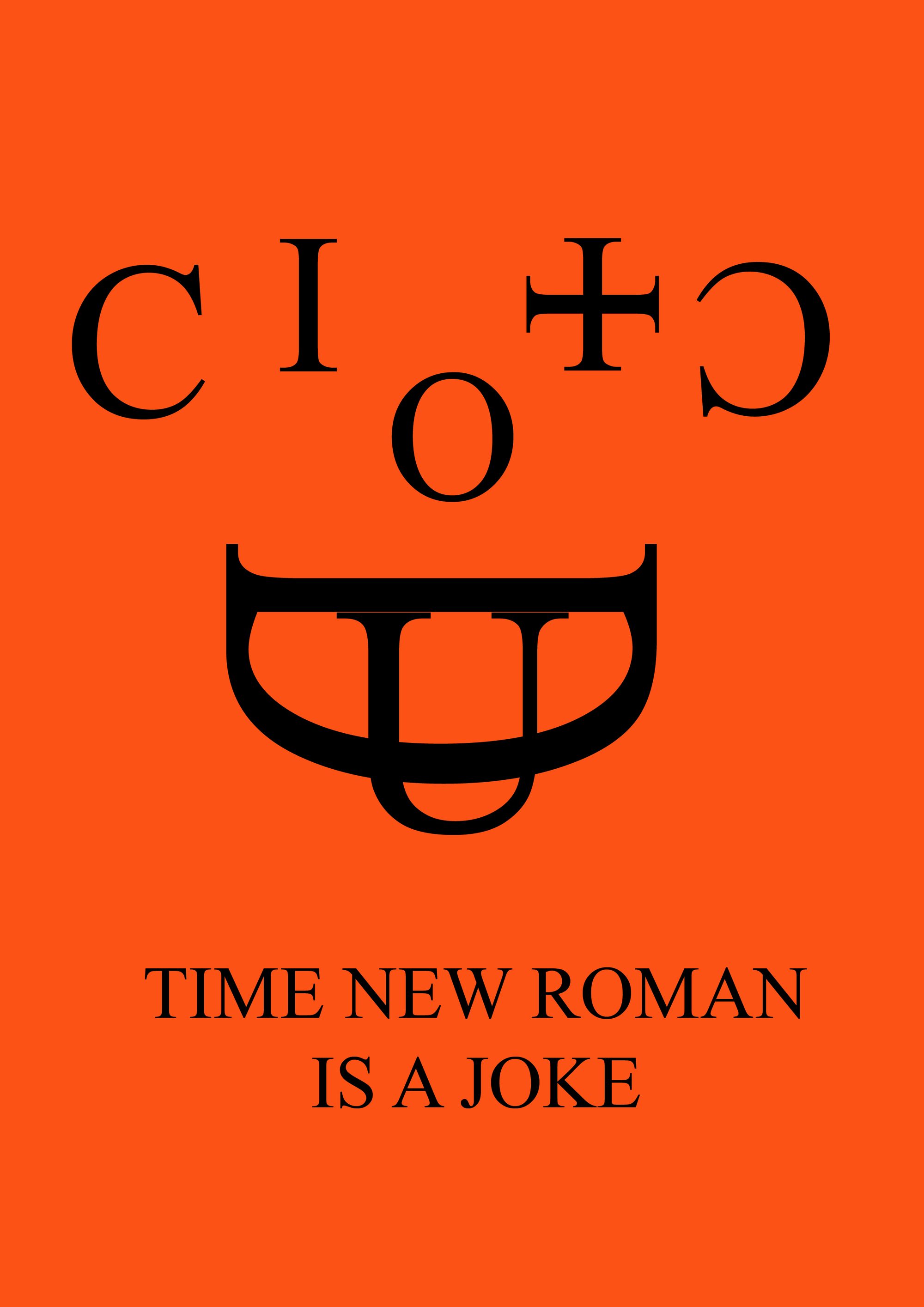
“Plus c’est moins” (less is more) cuts linear capitals with oblique slices, then runs a red bar through them. “Deux c’est mieux” (two is better) builds each letter from triangles, circles and rectangles, always in red and blue. The third exercise turns Arial and Times New Roman into portraits.
My Role
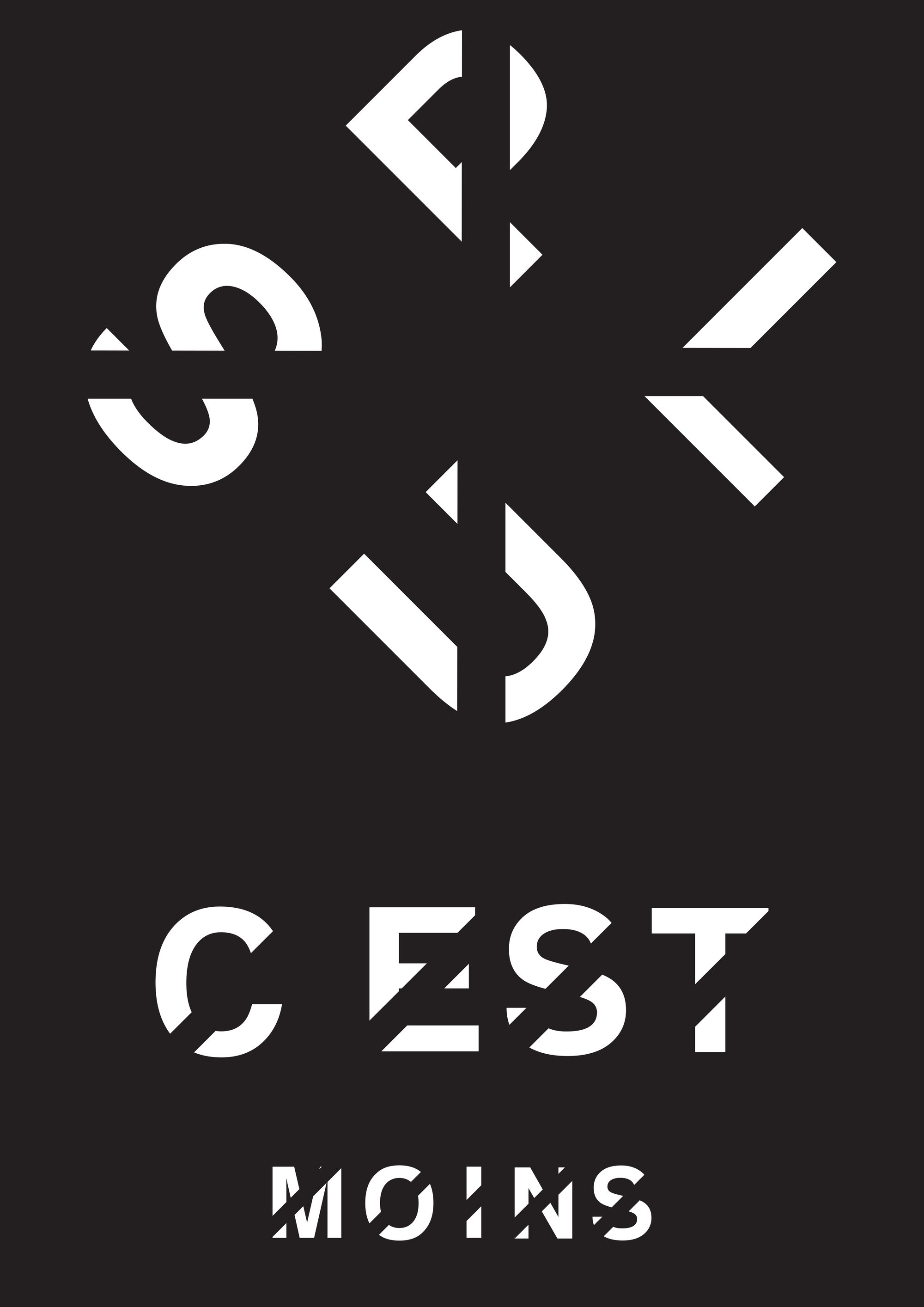
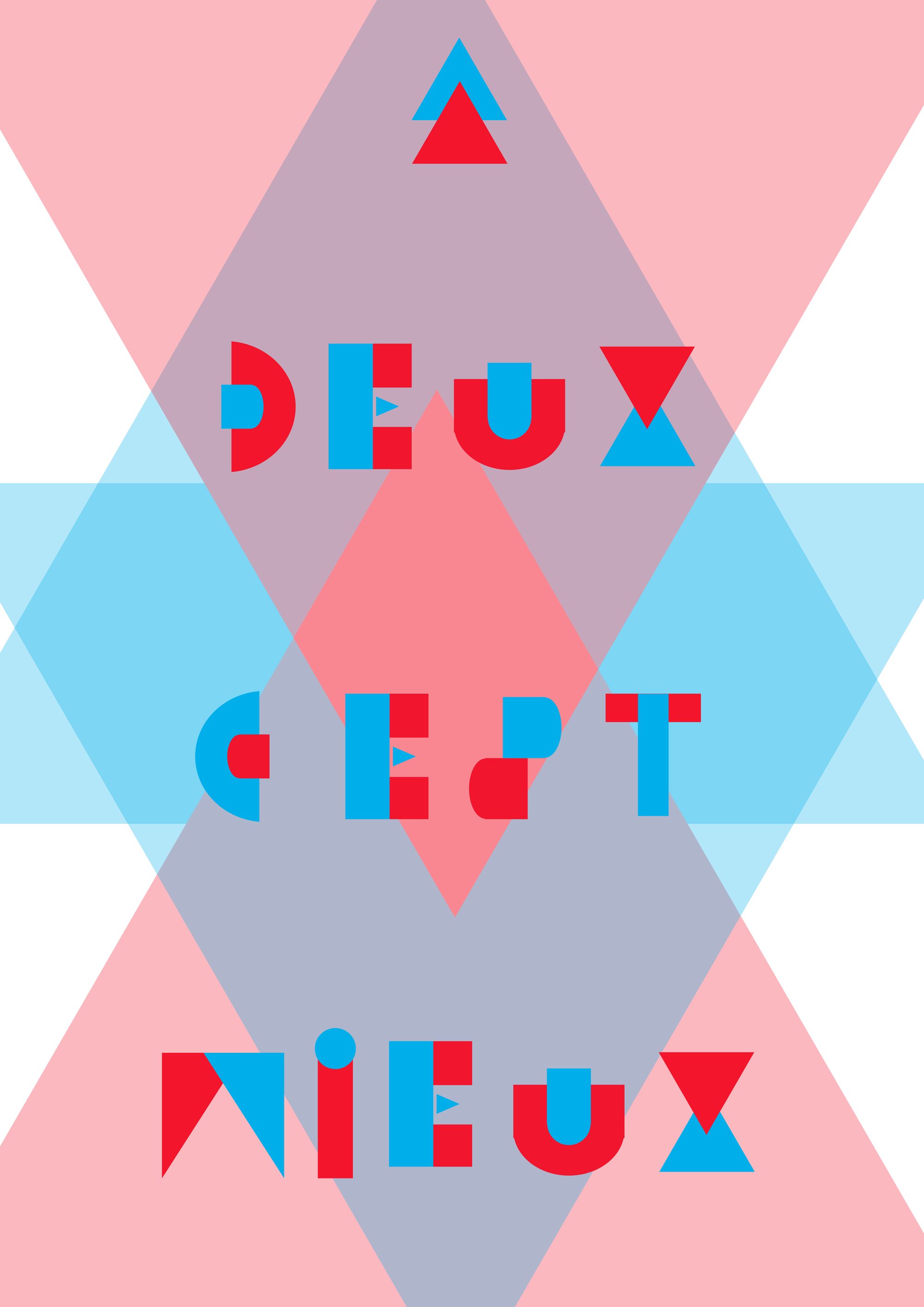
Each alphabet is first set out as a full A-to-Z sheet, then put to the test in a poster that states its own rule. The poster’s title is written in the alphabet it describes.
01
Capital Letter Design
02
Construction System
03
Colour Constraint
04
Typeface Subversion
05
Typographic Poster
Building the Identity
One colour per idea.
Each exercise has its own palette, cut to the bare minimum: the red that slices, the red and blue that fit together, a bright flat colour beneath the black.
Palette sampled from the project’s own visuals.
The Decision
The rule is the drawing.
The Work
In detail.
Plus c’est moins
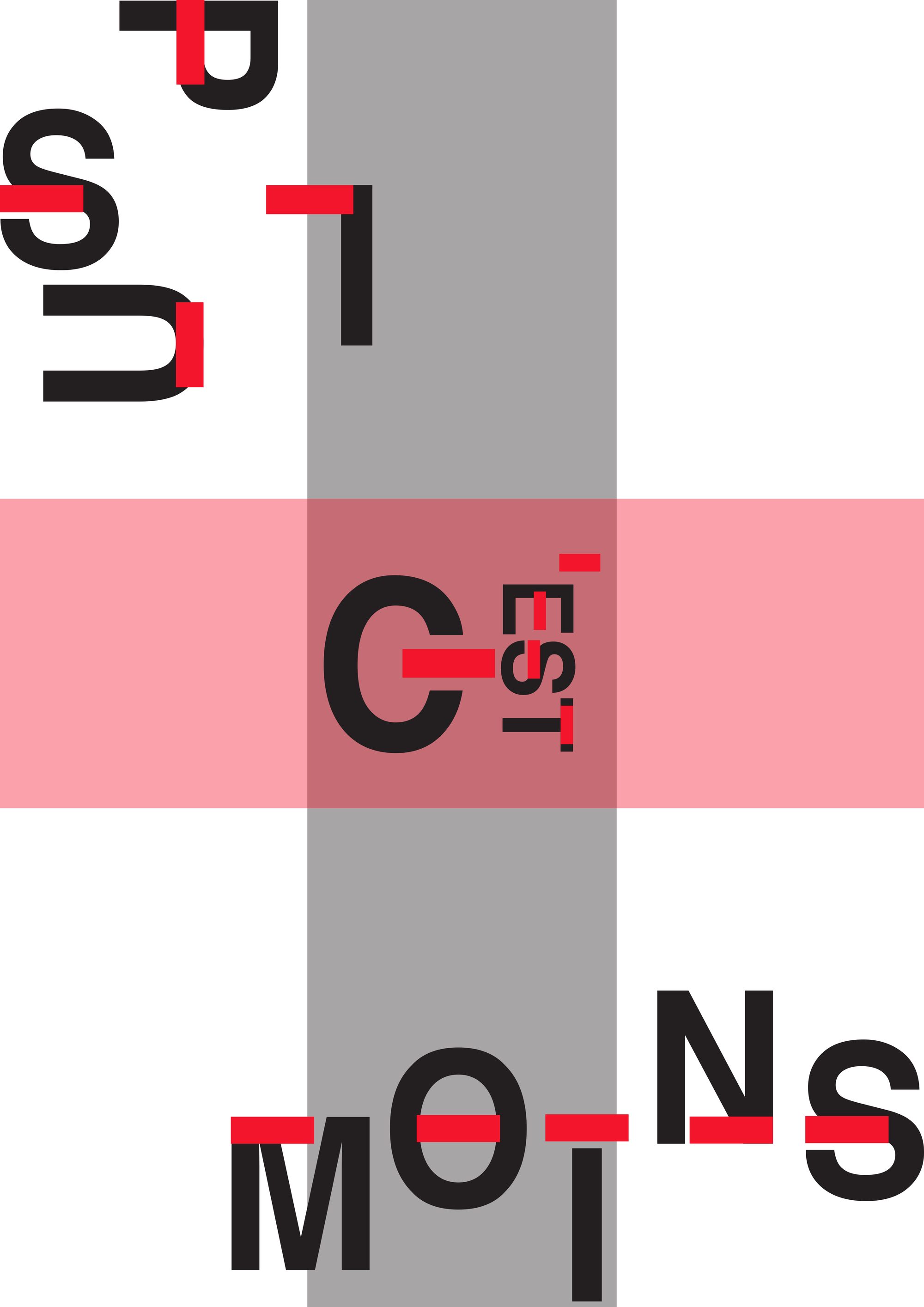
The oblique cuts take away part of each letter’s stroke, and the letter stays legible. On the poster, “plus” scatters into fragments turned every which way; “c’est moins” stays upright.
The red bar
A second state of the same alphabet: a horizontal red bar crosses each letter at a different height and interrupts its stroke. The poster crosses a vertical grey band with a horizontal pink one, and sets “c’est” where they meet.
Deux c’est mieux
No letter is made in one piece: each is an assembly of at least two simple shapes, one red, one blue. The poster takes the principle up to full scale, with translucent diamonds overlapping one another.
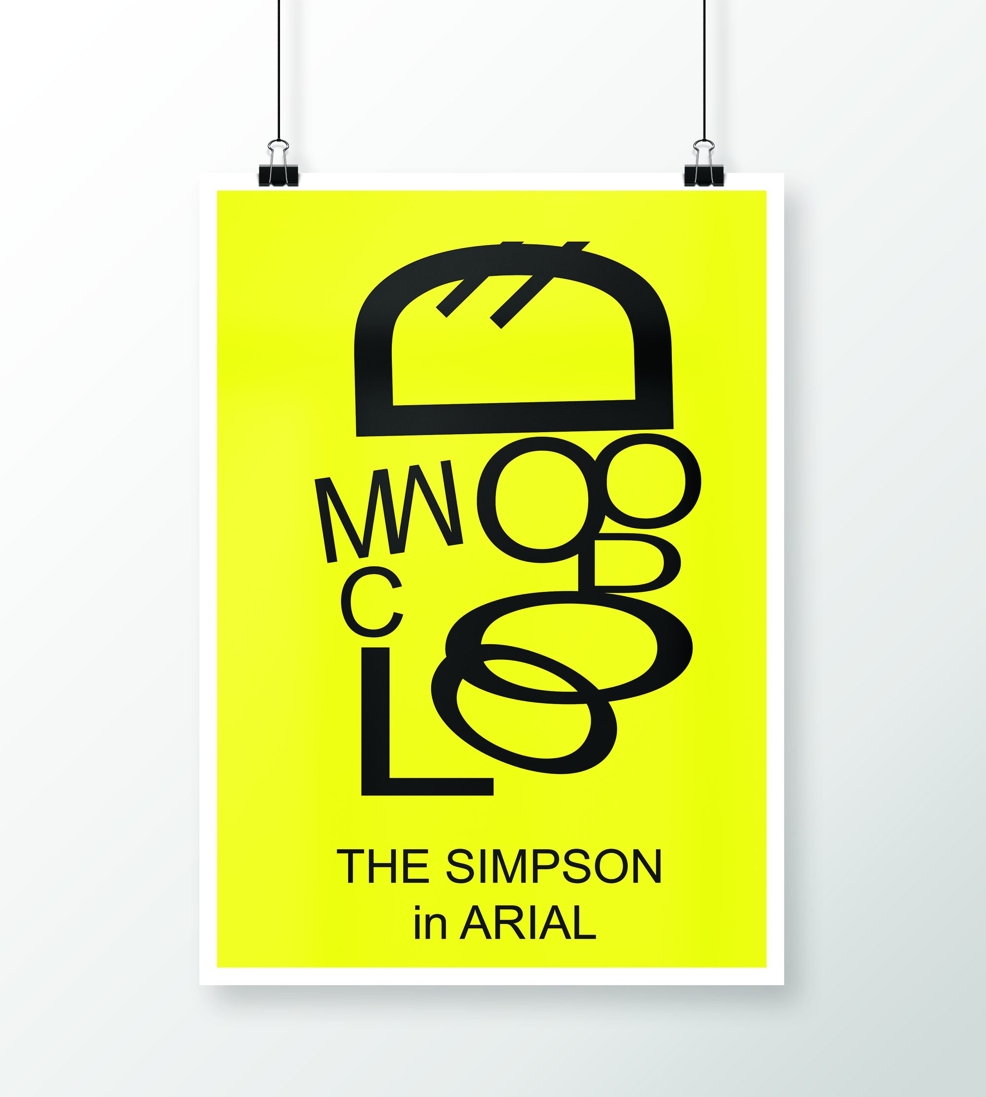
The Simpson in Arial
A Simpson face drawn using nothing but Arial letters — flipped, stretched and stacked — on the series’ yellow.
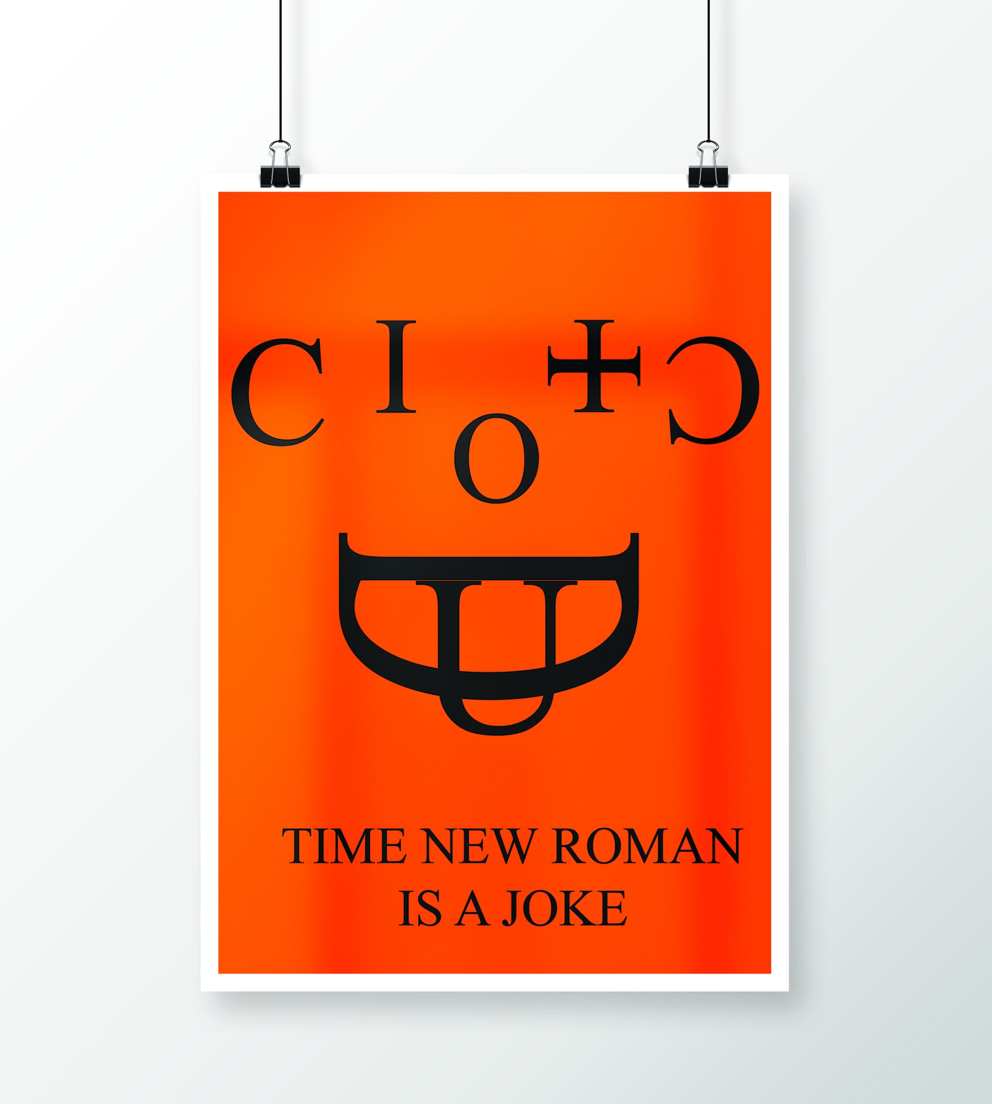
Time New Roman is a joke
The same exercise with Times New Roman: a few Cs, an I, an O and a U are enough to make a grinning face on an orange ground.
Plates
The plates
In short
Three rules,
three scripts.
None of the alphabets chases originality for its own sake: each pushes a single constraint through to the end of the alphabet, and it is the consistency of the rule that makes the form.
Typographic Experiments